5 Design Tips to Make Striking Instagram Video Thumbnails
Follow these 5 design tips to make striking Instagram video thumbnails that will leave a lasting impression on anyone who comes across them.
Instagram is increasingly focused on video content, and if you’re a creator trying to expand your following on the platform, you should be too. Data suggests videos encourage stronger engagement, with larger accounts receiving up to double the number of comments on videos than photos.
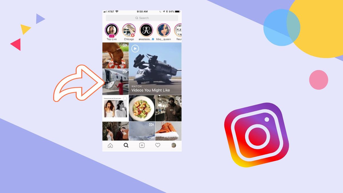
The Instagram Explore page is a popular way people find new accounts to follow. This is exactly where you want your videos to stand out. There’s one easy-to-forget step that can help with that: the cover image! Many creators set the default for their Instagram video thumbnail, which is the first frame of their video as the thumbnail. This is a missed opportunity.
In this article, we'll make sure you take this opportunity to make cohesive, eye-catching Instagram video thumbnails. Read on to learn:
- Why you should make an Instagram video thumbnail.
- 5 simple design tips to keep in mind (with examples).
- How to make a Instagram video thumbnail online for free.
Why you should make an Instagram video thumbnail
Planning, shooting, and editing videos takes time and thought, so you might be ready to hit ‘Share’ the second you’re done. Don’t let the idea of having to go this extra step intimidate you, though. You can create a great cover in the time it takes to brew a cup of tea.
By making an Instagram video thumbnail, you're able to cover three things that the default thumbnail (the first frame of your video) might not be able to: streamline your aesthetic, communicate your post's intent, and draw more attention to your page.
At the end of the day, you want your post to be exclusively yours. You want it to have your fingerprint on it, as if it could only come from you. To do this, you need to make your own Instagram video thumbnail.
Designing the Perfect Instagram Video Thumbnail
You don’t have to have any background in design to make a strong cover in no time at all. You can accomplish just as much as a professional designer by following the next 5 steps:
- Stay simple
- Practice color theory
- Use text
- Think high contrast
- Be consistent
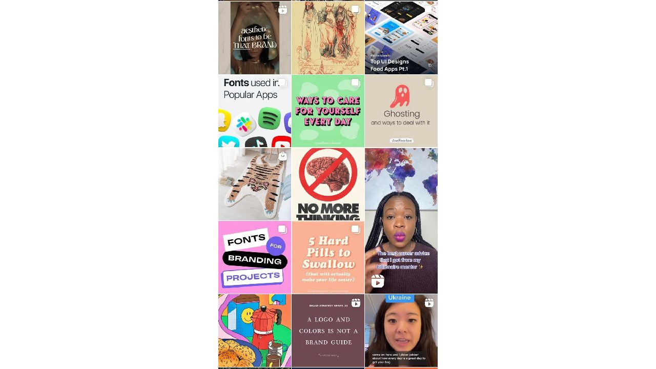
1. Stay simple
The Explore page is busy enough. People are on their phones, taking only half a second to scan through videos as they scroll through their feed.

These thumbnails pictured above don't lose any fine details to the chaos of the Explore page. It's almost calming to see so little visual data demanding attention against the other Explore tiles. In this case, less is definitely more.
2. Color theory
Consider the color wheel: colors on opposite ends (or close to it) are reliably pleasing when paired. Think blue and orange, or pink and lime. Similarly, different shades of the same hue, like light blue and navy, will always look nice.
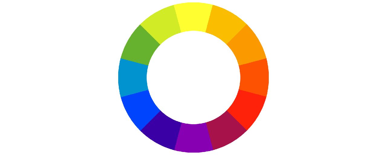

Look how well these covers pop! @thewilsonwing's complementary yellow and blue pull the eyes so effectively it barely matters what the text says. @rhi.scran draws eyes with use of near-complementary colors. A red-orange title against a green background is pleasing in itself, but the way the title also draws color from the image behind it completes the effect.
3. Use text
A lot of people keep their phone volume muted, and they might quickly swipe away from the first few seconds of your video if the payoff is not immediately clear. This means audio cues might not cut it to hold interest, and titles are your friend.
Text overlay is good for a hook (“He said WHAT?!”) or an overt value statement (“3 Ways to Ace an Inverview”).

@ossa.tv uses text to pose a question. You want to click to see the answer, right? Even if you don't care about the subject matter, questions pull you in.
@thecheatsheets uses text to show this will be an informative video about Excel. The footage here of data in a spreadsheet won't scream out to viewers on its own, but a cover with this title presents the video's clear value to its ideal audience looking to upskill.
4. Think high contrast
This is a basic principle behind good design: emphasizing difference. Be bold. If you’re using text, keep it large, legible, and make the colors contrast with the background (white text on dark background, dark text over a light-colored box, etc.).
Think about what's on your Explore page–you could follow the trends to blend in or try doing the opposite to stand out!

These covers by @josiebrooksphotography and @fercozzi_letras show how color and size can be used to create contrast, which generates interest. Dark is darker against light, and vice versa. You want any design element to be clear, and contrast helps organize focus.
5. Be consistent
Potential followers will start to see your videos on the Explore page and know it’s you. If they like these videos they’ll get the sense of future value from you and give a follow.
Repetition is another basic design principle. Make your profile look professional by repeating elements like colors, filters, and fonts.
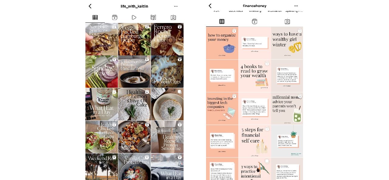
See how easily identifiable @life_with_kaitlin and @financehoney's videos would be "in the wild?" Using the same fonts and content and/or sticking to a color palette will give your profile a thoughtful, curated look. Make a few decisions up front and stick with them.
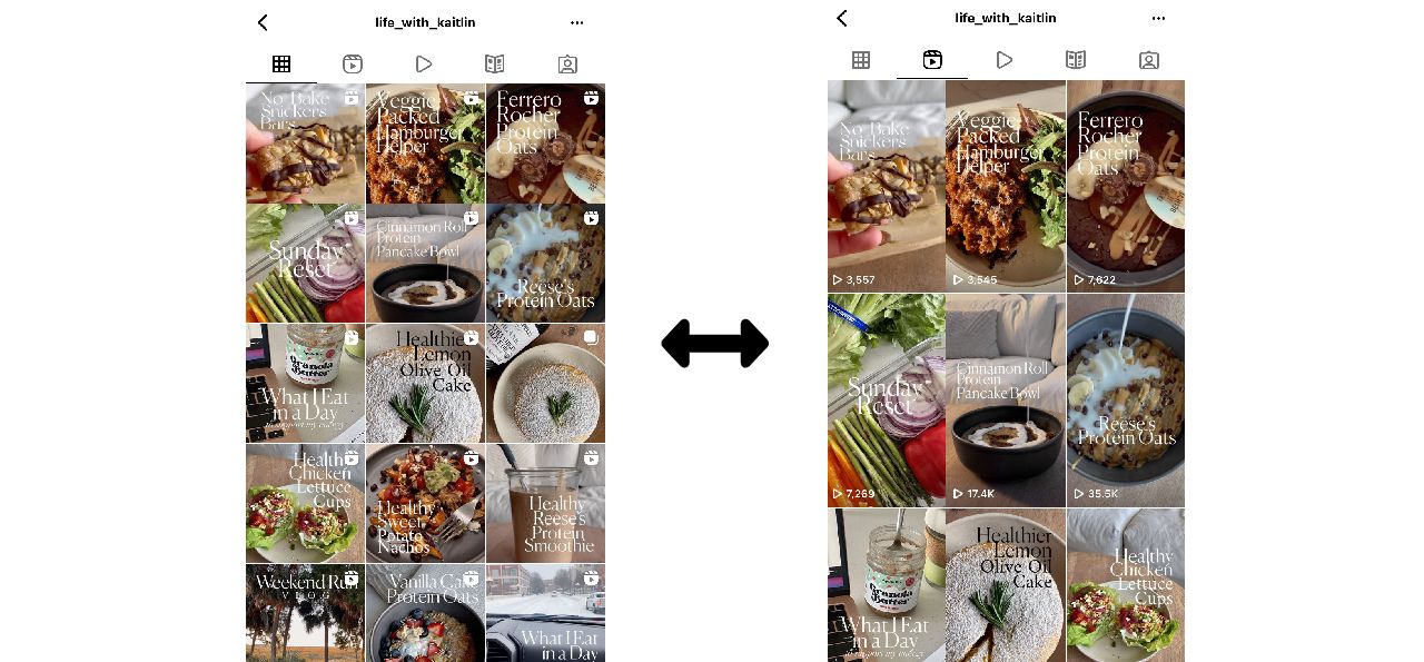
Bonus tip: Think in squares
The Explore page will likely crop your video to a square. When someone looks at your profile, they’ll see feed videos cropped to a square there as well. Even if your video fills a different aspect ratio, keep text and important visual data in a square frame!
Resize your Instagram video online for free on Kapwing.
How to make your Instagram video thumbnail
Luckily, you can make your own Instagram video thumbnail by using the free, online content creation tool Kapwing. Follow the next steps to get started:
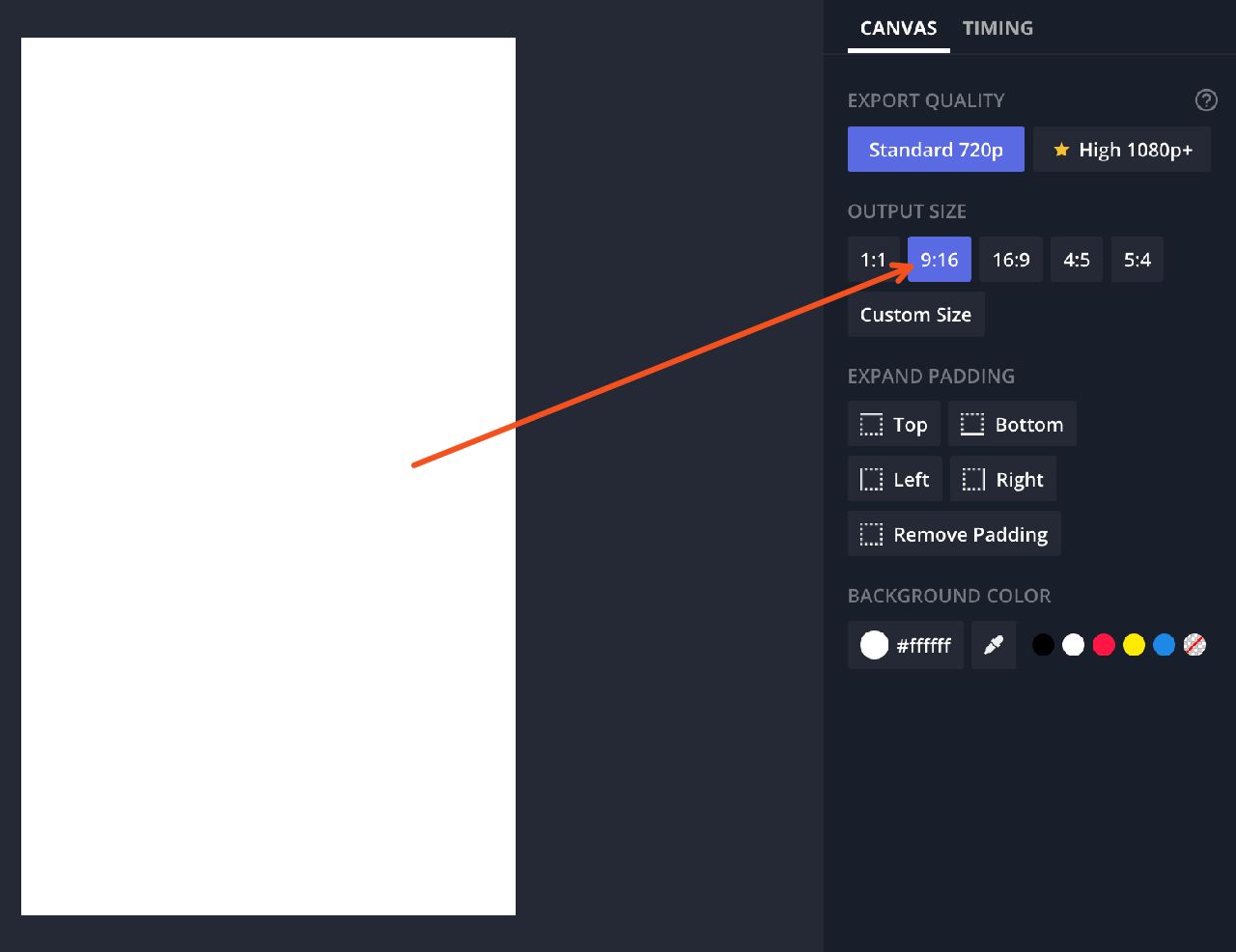
- Open Kapwing on a computer or smartphone and set the blank canvas to 9:16. Or, try out one of Kapwing's free and customizable Instagram templates.
2. Create and edit your design following the tips in this article.
3. Click Export Image, then download your creation, saving it to your camera roll.
4. Open Instagram, and select the video you want to post.
5. Complete in-app video editing, if any, and then before you hit 'Share,' select the small preview frame in the top left corner that says 'Cover.'
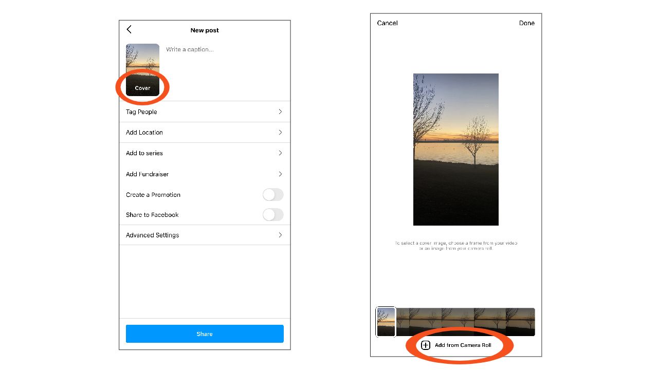
6. Choose the cover image from your camera roll, and post your video!
Enjoy!
If you found this article helpful, make sure to stay updated with more editing tips and content trends by visiting the Kapwing Resources Page or subscribing to the newsletter below. And be sure to stay in touch by following Kapwing on Twitter and Instagram.
Related Articles