What Are the Best Fonts for Video Subtitles? Here’s a Research-Backed Answer.
We've rounded up the best fonts for subtitles, summarized why they work, and shared tips on choosing the right font for your videos.
Maybe you've seen the stats: 80% of viewers are more likely to finish a video with subtitles. What's more, the number of people who use subtitles is on the rise, with 50% of Americans now turning on subtitles “most of the time” when watching video; that number jumps to nearly 80% for Gen Z viewers.
On short-form video platforms like TikTok and YouTube Shorts, subtitles do better both because they're more engaging (with visually-stimulating animations and changes on screen), easier to understand, and more accessible to viewers with the sound off.
Takeaway: Your video isn't done until the subtitles are added. But what font, or family of fonts, should you use? Although we wish there was a single, conclusive answer to that question, the research says how easy a font is to read and comprehend comes down to a personal preference. Put another way, the "best" font varies from person to person.
However, there are certain traits that viewers prefer for fonts when reading from a mobile screen. Knowing those traits, it's much easier to suggest subtitle fonts that meet the requirements. That said, let's dig into our top font picks for subtitles and video captions—and the research behind our recommendations.
✂️ Shortcuts:
- The best font choices for subtitles and captions
- What details matter for subtitle fonts?
- How to use custom fonts for your subtitles
The best font choices for subtitles and captions
1. Atkinson Hyperlegible
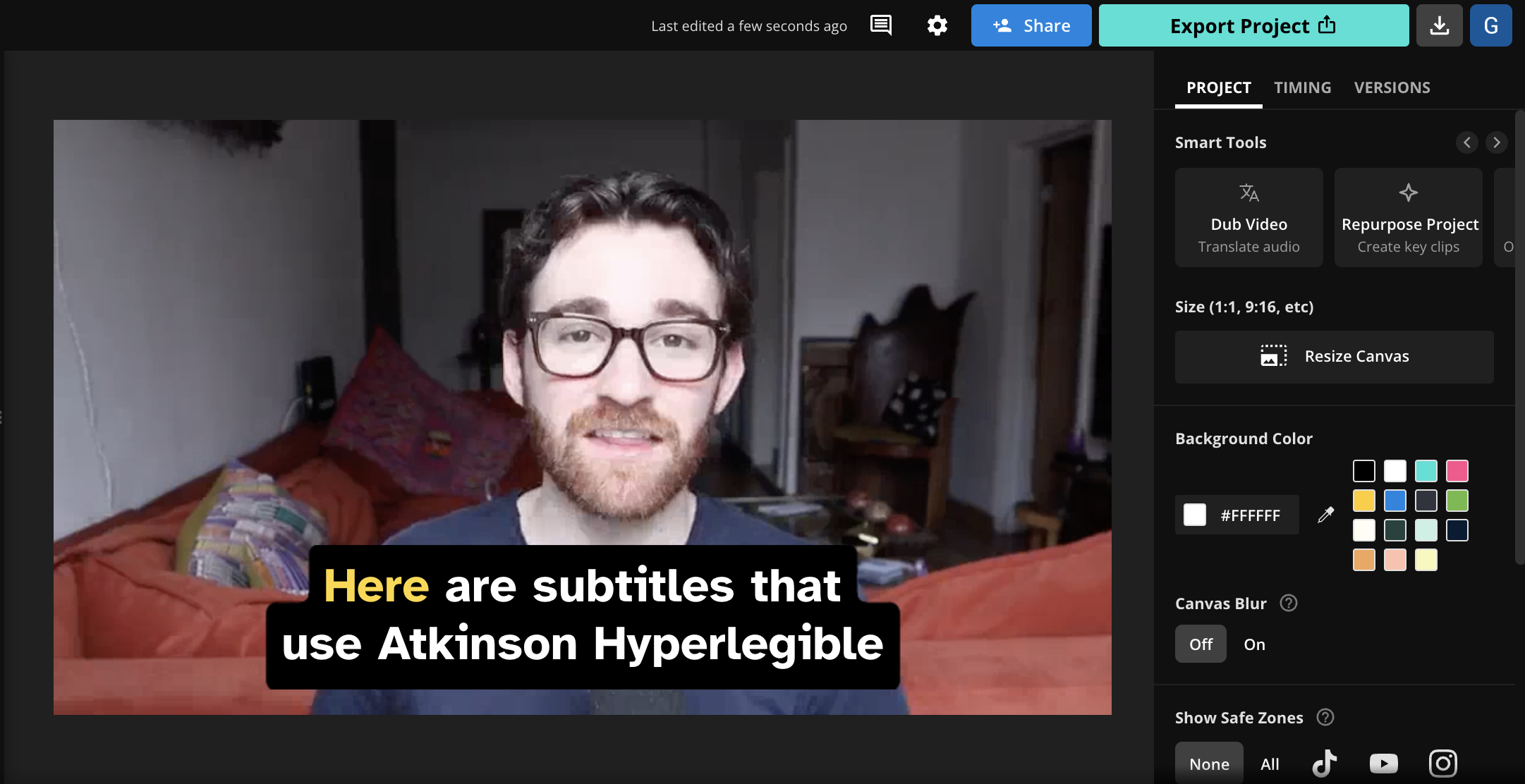
💡 About the font: Named after J. Robert Atkinson, founder of the Braille Institute of America, Atkinson Hyperlegible focuses on letterform distinction in order to make it easier to recognize each individual character in a section of text.
🎯 What makes it good: Research has shown that clear "letterform distinction" is especially helpful for viewers with low or impaired vision, and it improves readability and comprehension for all viewers. Atkinson Hyperlegible is designed around this principle and features ample spacing and distinct shapes for each letter.
As a result, the font makes it easy to differentiate characters on screen; especially similar characters such as 'I' and 'l' or 'e' and 'c'. This helps viewers read subtitles quickly and accurately, even if they're going by fast. Lastly, Atkinson Hyperlegible features a clean and straightforward design that works well with customization and won't distract from the content of the video.
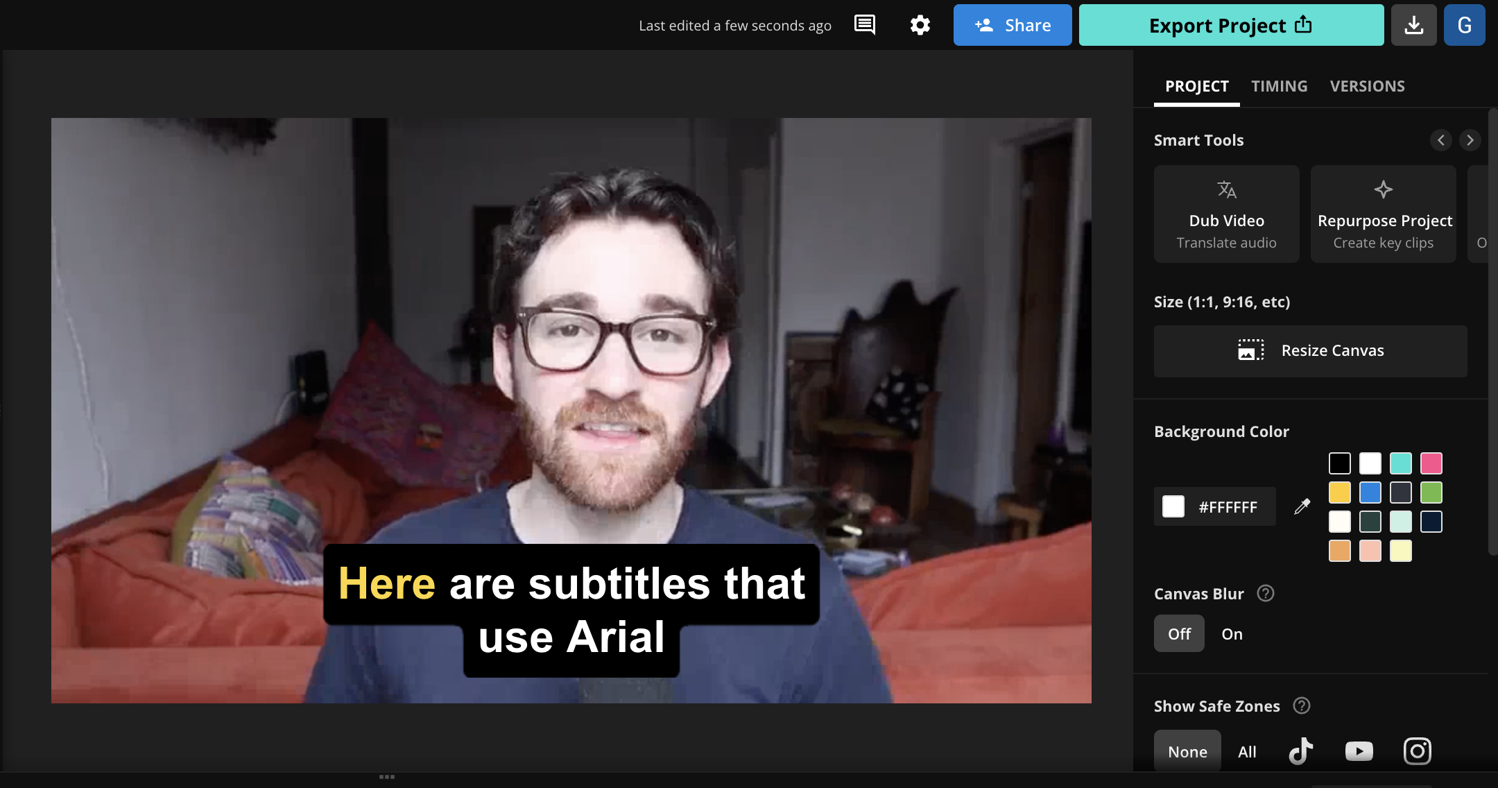
2. Arial
💡 About the font: Arial was created in 1982 by a team of designers at Monotype Typography, led by Robin Nicholas and Patricia Saunders. The development of Arial was part of Monotype's project to design a typeface that would compete with and serve as an alternative to Helvetica.
🎯 What makes it good: Arial is a sans-serif font that's flexible, easy to read, and free to use. Specifically, the uniform stroke widths and simple letterforms make Arial ideal for small screens. The fact that Arial is so popular and familiar benefits it as well—viewers won't have to spend much mental bandwidth when reading Arial as they've seen it a thousand times before.
Arial is maybe best described as a font that doesn't get in its own way. It is maybe the most neutral and uniform font available, and the lack of extraneous details makes it very simple to read. Although it's simple, Arial is also versatile in that it will fit a variety of visual aesthetics and video styles—it never really feels out of place. If your subtitles are being applied across a variety of formats, aspect ratios, or contexts, safe fonts like Arial are a good choice to consider first.
3. Montserrat

💡 About the font: Monserrat was inspired by the old posters and signage in the Montserrat neighborhood of Buenos Aires, where its designer, Julieta Ulanovsky, currently lives. Ulanovsky wanted to capture the character of the urban typography that was characteristic of the early 20th century in this area.
🎯 What makes it good: Monserrat is actually the default font we use at Kapwing for our subtitles tool. We chose Monserrat as it's a highly legible sans-serif font with ample letter spacing that also features a distinct aesthetic that makes it feel less generic than Helvetica or Arial. And, it stands out by not being the default font everyone is used to seeing.
Montserrat has slightly condensed letters that allow more text to fit comfortably on the screen. However, we recommend using the bold or extra bold weights of this font. The thin version of the font is very slender and can be hard to see, especially when it’s overlaid as subtitles with no highlight or background.
4. Lato
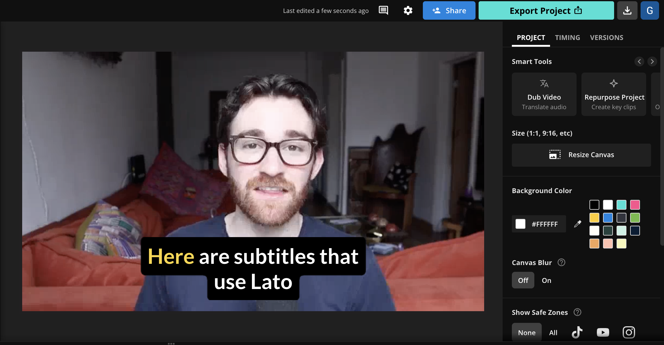
💡 About the font: Designed just over 10 years ago, Lato is another sans-serif font that's best used in bold, though the default font isn't as thin as something like Monserrat and could be used all on its own with the contrast between background and font color.
🎯 What makes it good: Lato also does a great job of mimicking the look and feel of default fonts like Arial and Helvetica, but stands out with semi-rounded letter styling that makes it feel more modern—some have called this look more "sophisticated" as well.
In either case, Lato balances its subtle design flairs with clear spacing and well-balanced characters that look crisp and clear even on smaller screens, which is what counts. Note that Lato is another font where we highly recommend one of Lato's bold weights—it features multiple options—as the default weight is a bit thin and may not display as clearly as you'd like, especially without a high-contrast background.
5. Open Sans
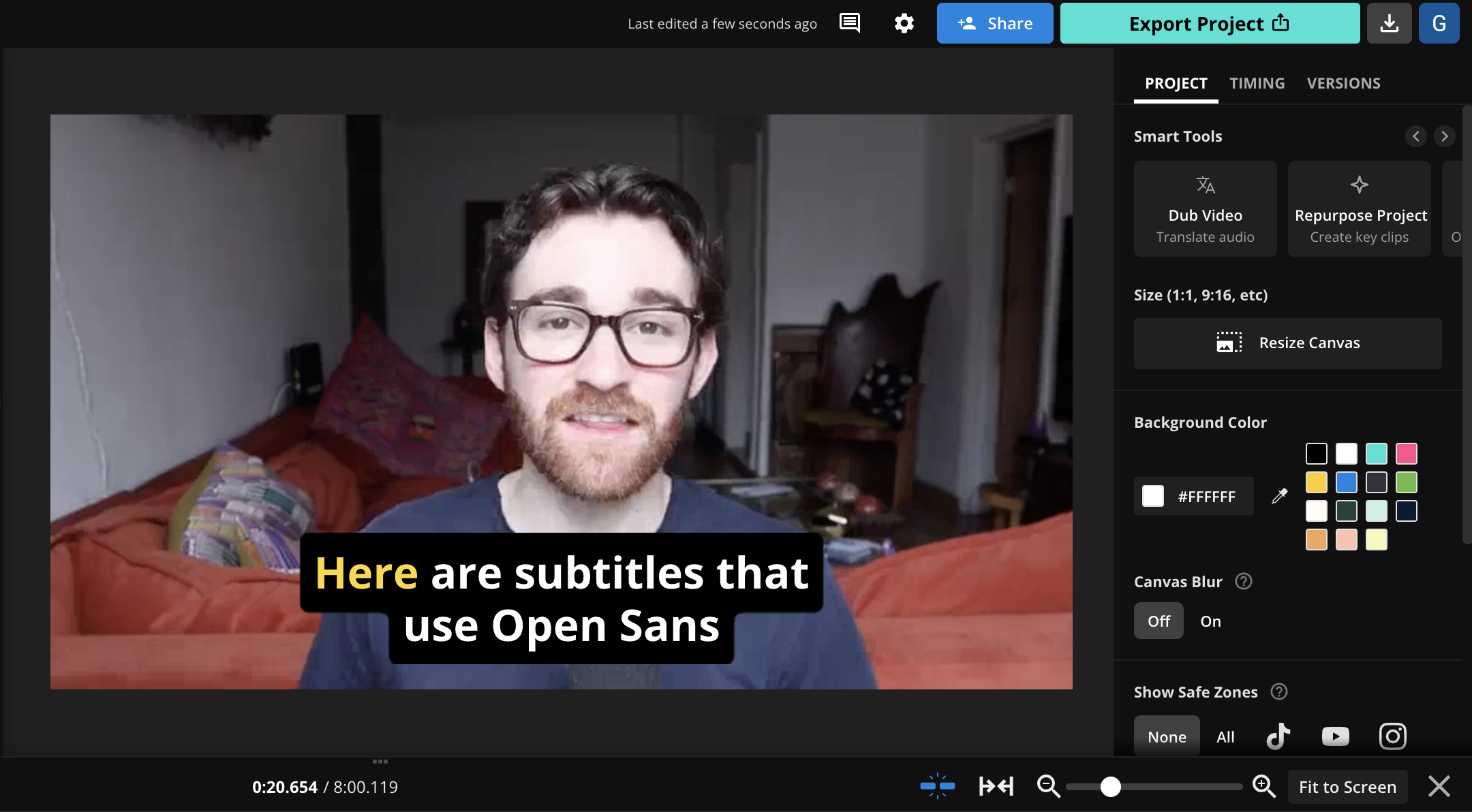
💡 About the font: Open Sans is a sans-serif typeface designed by Steve Matteson and commissioned by Google, which sought a universal font for all of its products. According to Google, Open Sans passed 10 trillion (yes, with a T!) total pageviews across all web pages that it's used on.
🎯 What makes it good: The design of Open Sans is based on classic typefaces such as Helvetica and Univers, but it has unique characteristics, including wider letter spacing. The font was designed with legibility on small displays and includes a tall x-height and wide letter spacing—a combination that's ideal for most video subtitles.
Open Sans was originally released in 10 weights, from Light to Extrabold, each with its italic version, with two more added in 2013 for a total of 12. The variety of weights available for Open Sans unlocks a lot of flexibility in choosing the appropriate level of boldness for different backgrounds. Legible, modern, and clean—Open Sans is a very safe choice for subtitles.
6. Libre Baskerville
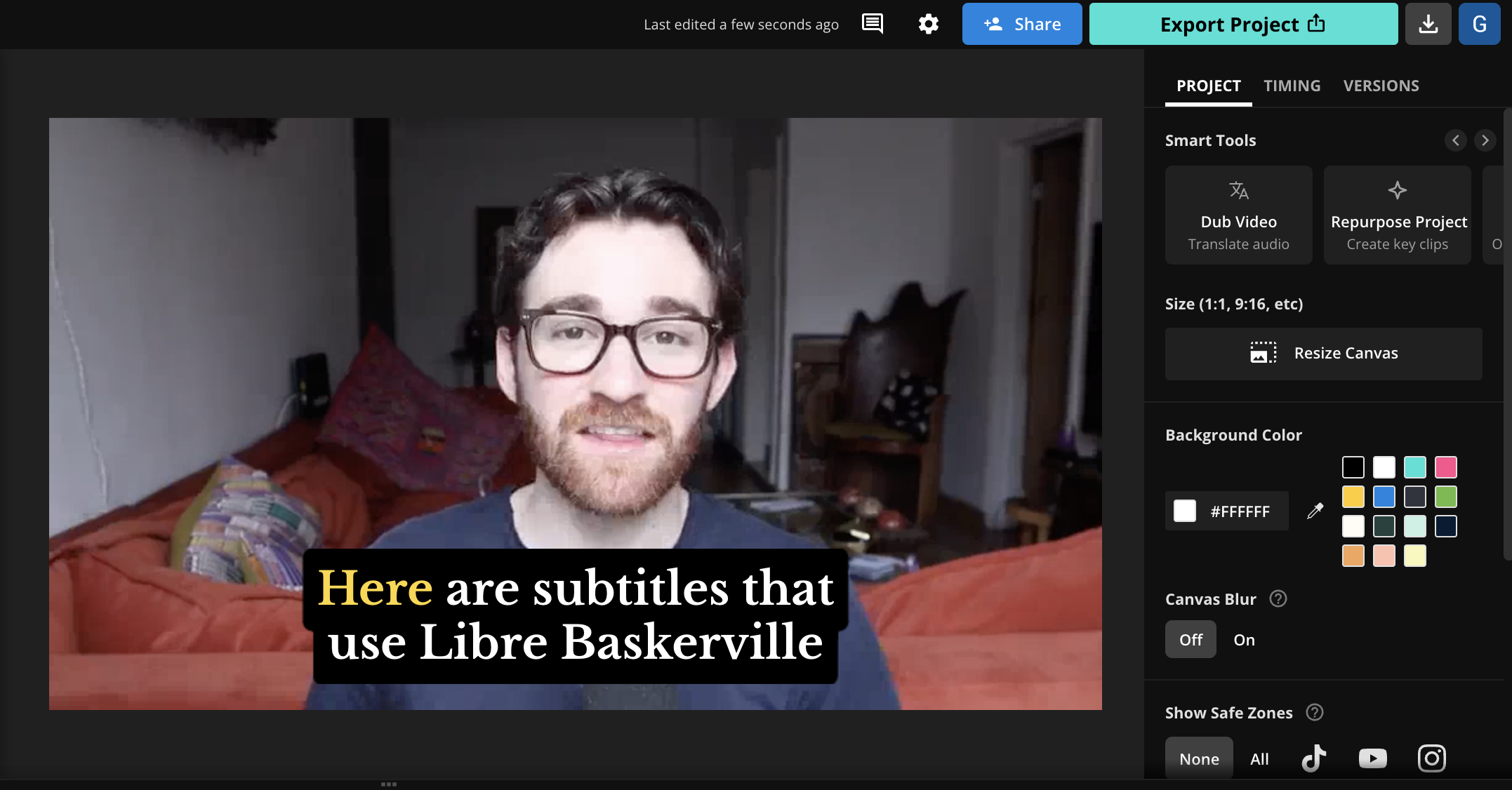
💡 About the font: Designed by Pablo Impallari in 2012, Libre Baskerville is based on the classic Baskerville font created by John Baskerville in the 1750s. The font includes various improvements to the original Baskerville, such as the height of the lowercase letters relative to the uppercase letters.
🎯 What makes it good: Serif aficionados rejoice—there are relatively few serif fonts with spacing that make for good video subtitles, but Libre Baskerville is one of those exceptions. Unlike serif fonts such as Garamond, Libre Baskerville leaves enough space between letters that it remains a highly readable font even as an animated or quickly-moving subtitle.
Libre Baskerville also includes a range of weights, from light to bold, as well as italics, providing video creators with a versatile range of options. The well-proportioned letters and carefully designed serifs also make Libre Baskerville one of few fonts with an "elegant" aesthetic that doesn't feel too cluttered or overpowering for subtitles. If that's the style that fits your brand, Libre Baskerville is a font that should make your shortlist.
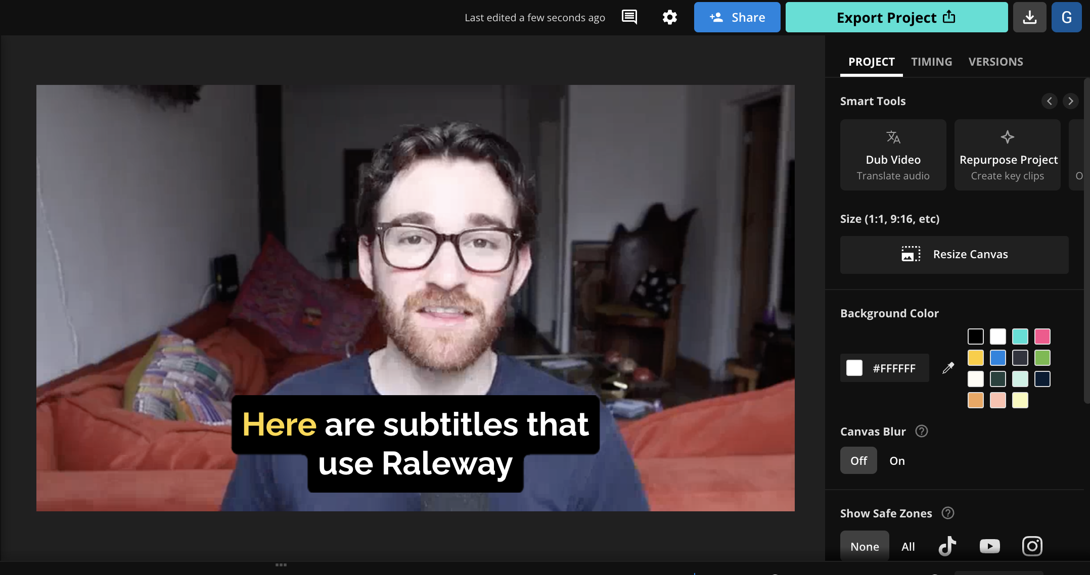
7. Raleway
💡 About the font: Raleway is a sans-serif typeface designed by Matt McInerney for a university project. The font was originally inspired by "geometric sans-serif typefaces" such as Futura and Avant Garde, which were popular in the 1920s and 1930s.
🎯 What makes it good: Raleway features a high-contrast design with elongated letters and distinct characters. The font has a sleek look that has made it popular in a variety of design contexts—but we also really like it for subtitles. However, we once again strongly recommend using the bold or extra bold weights for Raleway, as the default and lighter weights are very thin.
With the right weight, Raleway is a good choice for subtitles thanks to its contemporary design that features clear and well-spaced characters. Raleway is also one of few fonts with an almost-elegant sans-serif look that actually works as subtitles—many other fonts in this style don't feature strong enough weights, or include other flourishes that make them too hard to read on small screens.
8. Noto Sans
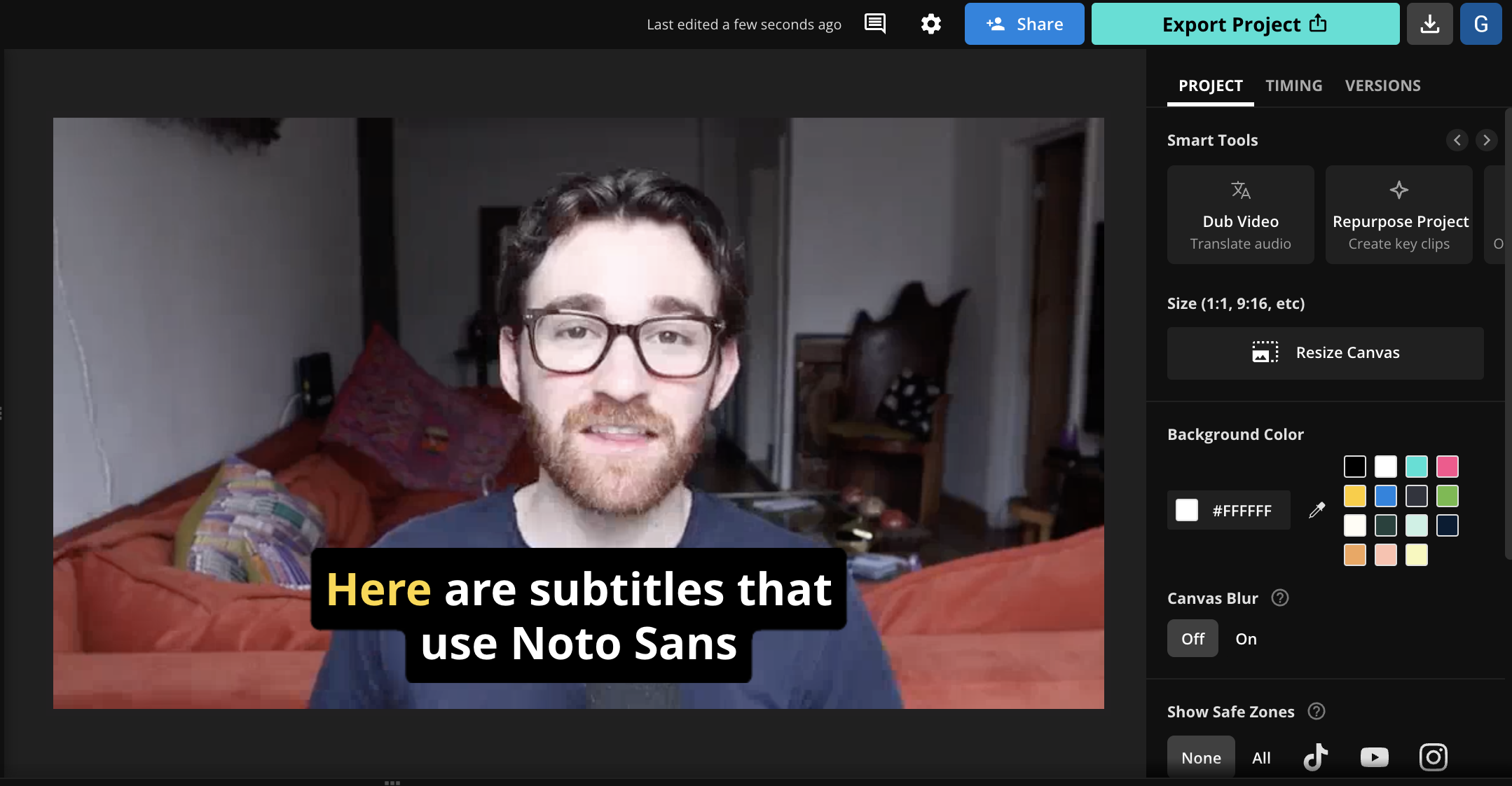
💡 About the font: Noto Sans has an interesting history: it was commissioned by Google to try and eliminate "tofu" characters on the web, and in fact stands for "no tofu." Tofu characters are those that can't be displayed on-screen because a user doesn't have a font installed that's capable of displaying them.
🎯 What makes it good: Noto sought to fix the tofu problem by including tens of thousands of characters in over 1,000 different languages. That makes it a great option for creating non-English subtitles, or if you plan on translating subtitles across multiple languages.
The font's style is modern and clean, with slightly rounded edges that soften its appearance and help the font feel approachable and casual, rather than overly formal. For our purposes, the font is also highly legible on screens of smaller sizes with a uniform stroke width and unobtrusive style, which makes it a top choice for subtitles.
9. Georgia
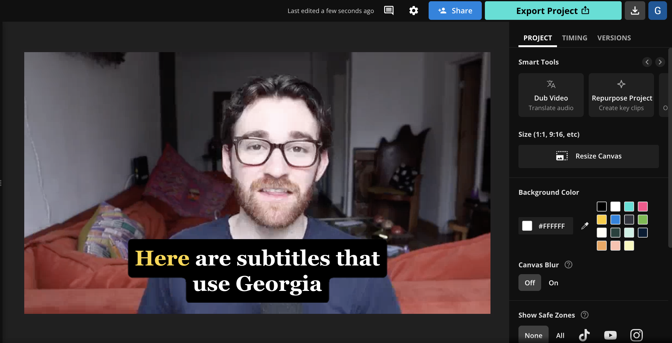
💡 About the font: Georgia is a serif typeface designed by Matthew Carter and released in 1993 by Microsoft. Georgia was designed as a companion to the sans-serif Verdana font and for on-screen reading, particularly at small sizes on the low-resolution screens which were standard at the time.
🎯 What makes it good: Georgia, like many fonts on this list, was specifically designed to be clear and legible on digital screens. In Georgia's case, that means its wider letters and a large height for small letters (known as "x-height") make it easy to read quickly, or when reading at a glance. This is obviously key for subtitles, where viewers need to read and understand text fast.
What also sets Georgia apart are its clear and functional serifs which result in characters that are easy to discern and differentiate—a common problem with other serif fonts is confusing some "busy" characters which can look similar when read quickly. The characters in Georgia are also larger and bolder than most serif fonts, and its classic design won't make it a distracting focal point in a video.
10. Roboto

💡 About the font: Roboto is a font released by Google in 2012 and designed in-house by Christian Robertson for Android, Google's mobile OS. The font is very popular across the web and on mobile apps, and before 2019, it was even the default font used by the US government.
🎯 What makes it good: Given that Roboto was originally designed for use on mobile, it's no surprise it's highly legible and works especially well on small screens. Roboto also shines on vertical video since its sleek design sits a bit taller than some other popular sans-serif fonts.
Roboto also offers a style that is more akin to handwritten type than fiercely neutral fonts like Helvetica. This is partly due to the font's geometric style, which combines shapes like squares and circles to create lettering that is primarily straight with some softer edges, a design detail that makes the font feel more casual than other, more rigid typefaces. The fact that these small details make Robot recognizable, even on small screens, also speaks to its legibility.
11. Helvetica
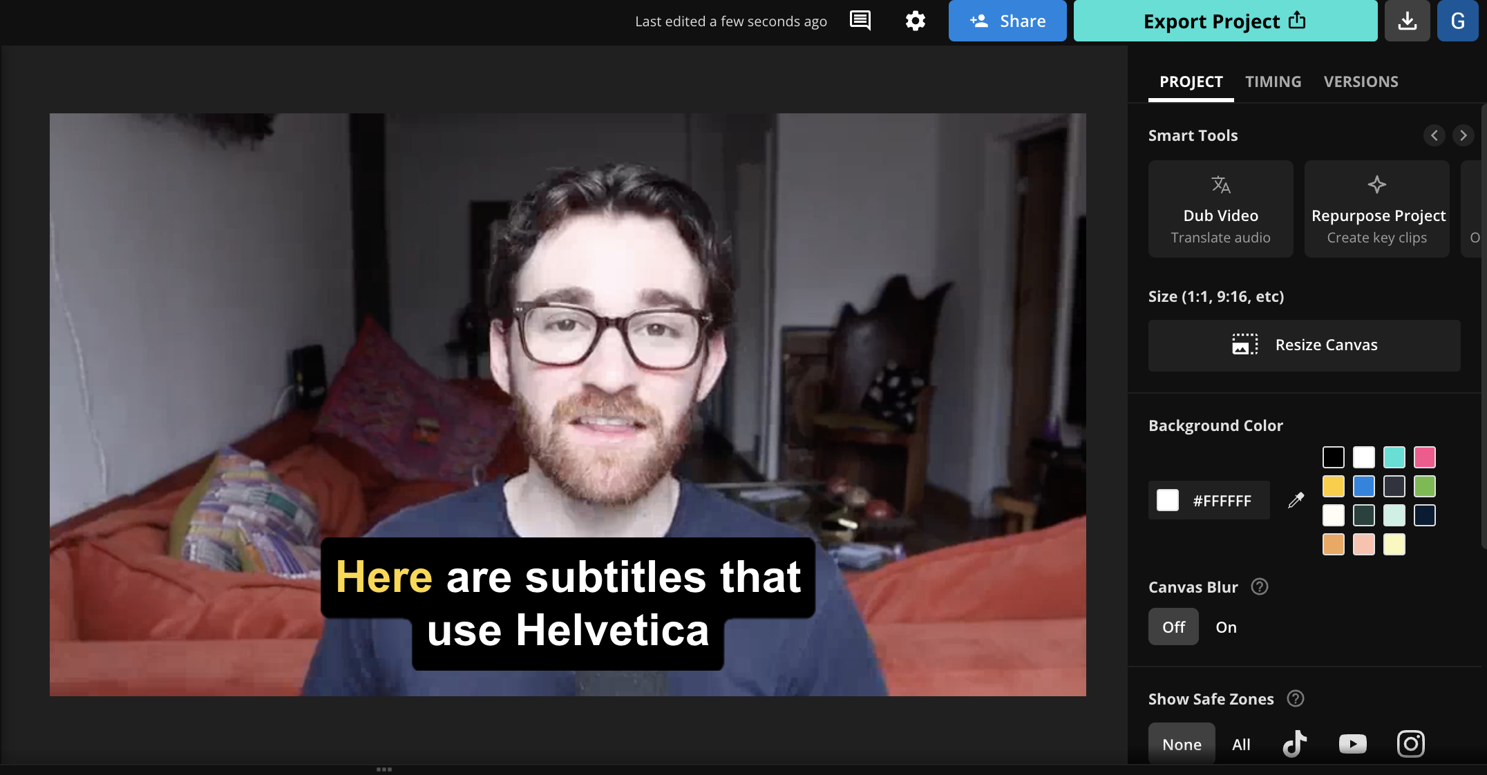
💡 About the font: Helvetica is a popular font created in 1957 by Swiss typeface designers Max Miedinger and Eduard Hoffmann. Its original name was "Neue Haas Grotesk," though in 1960, its name was changed to Helvetica, derived from Helvetia, the Latin name for Switzerland.
🎯 What makes it good: Helvetica is the definition of a timeless typeface. It's universally recognizable and for good reason: it's highly readable with crisp lines and balanced proportions, and it features a clean and neutral design that is maybe an embodiment of its Swiss heritage. And remember, simple fonts often make the best options for e.g. custom color combinations, since they're so legible and clear.
Helvetica is a straightforward and unmessy typeface that offers just enough stylistic flair that makes some designers prefer it over similar fonts like Arial. Its uniform style and evenly-spaced characters also make it a great choice for text on small screens, which is why it's one of our picks as a subtitle font. In truth, there are very few contexts where Helvetica could be considered a poor or unsafe font choice.
12. Source Sans Pro
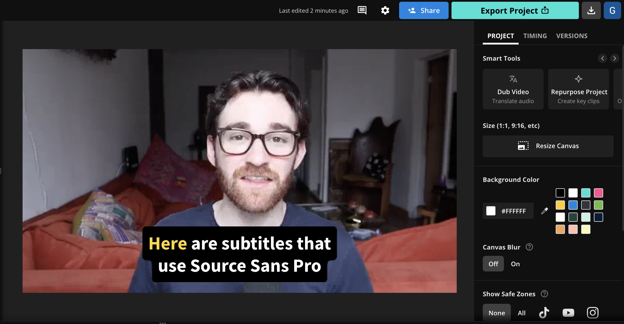
💡 About the font: Source Sans Pro, Adobe's first open-source typeface, was designed by Paul D. Hunt and released in 2012. It marked a significant step in Adobe's approach to font design, embracing the open-source model to provide a versatile font that could be freely used and modified by the public.
🎯 What makes it good: Source Sans Pro stands tall as a font for subtitles thanks to its generous letter spacing, large x-height, and distinct character shapes. In fact, Source Sans Pro takes special consideration to ensure all the available letters look distinct so that e.g. a lowercase "L" doesn't look like an uppercase "I" or the number "1".
Source Sans Pro was also specifically designed to look good on small screens, with characters that remain legible even when condensed or compressed to low resolutions—which makes it ideal for vertical video, which now plays on much higher-fidelity screens than in the past.
13. PT Sans
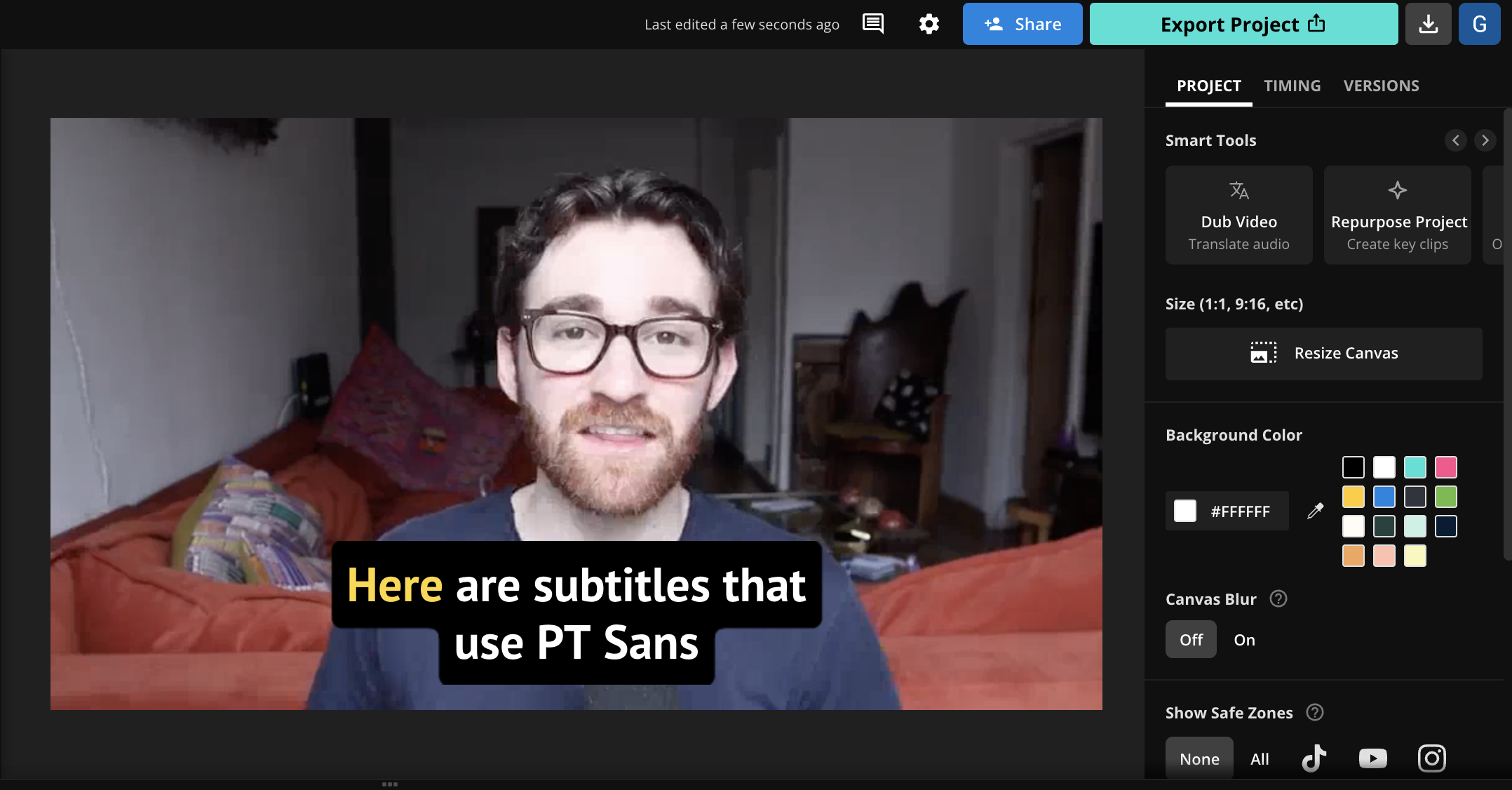
💡 About the font: PT Sans, part of the Public Types of Russian Federation project, was created to provide a versatile font family for diverse use in Russian and European languages. Designed by Alexandra Korolkova, Olga Umpeleva, and Vladimir Yefimov, it was released in 2009 by ParaType.
🎯 What makes it good: PT Sans shares many characteristics with Source Sans Pro including its wide proportions, large x-height, and clear distinction between characters to avoid confusion. As a result, PT Sans is also an excellent choice for subtitles and captions.
PT Sans can also be considered a contemporary version of Verdana; PT Sans is generally viewed as having a more condensed and space-efficient design, which allows more text on the screen without a feeling of clutter. In contrast, Verdana is usually thought of as having a wider design with slightly better legibility, which often requires it to take up more space on the screen. Aesthetically, PT Sans feels more modern and a bit more refined than Verdana, so it's up to you to decide which tradeoffs matter.
14. Nunito
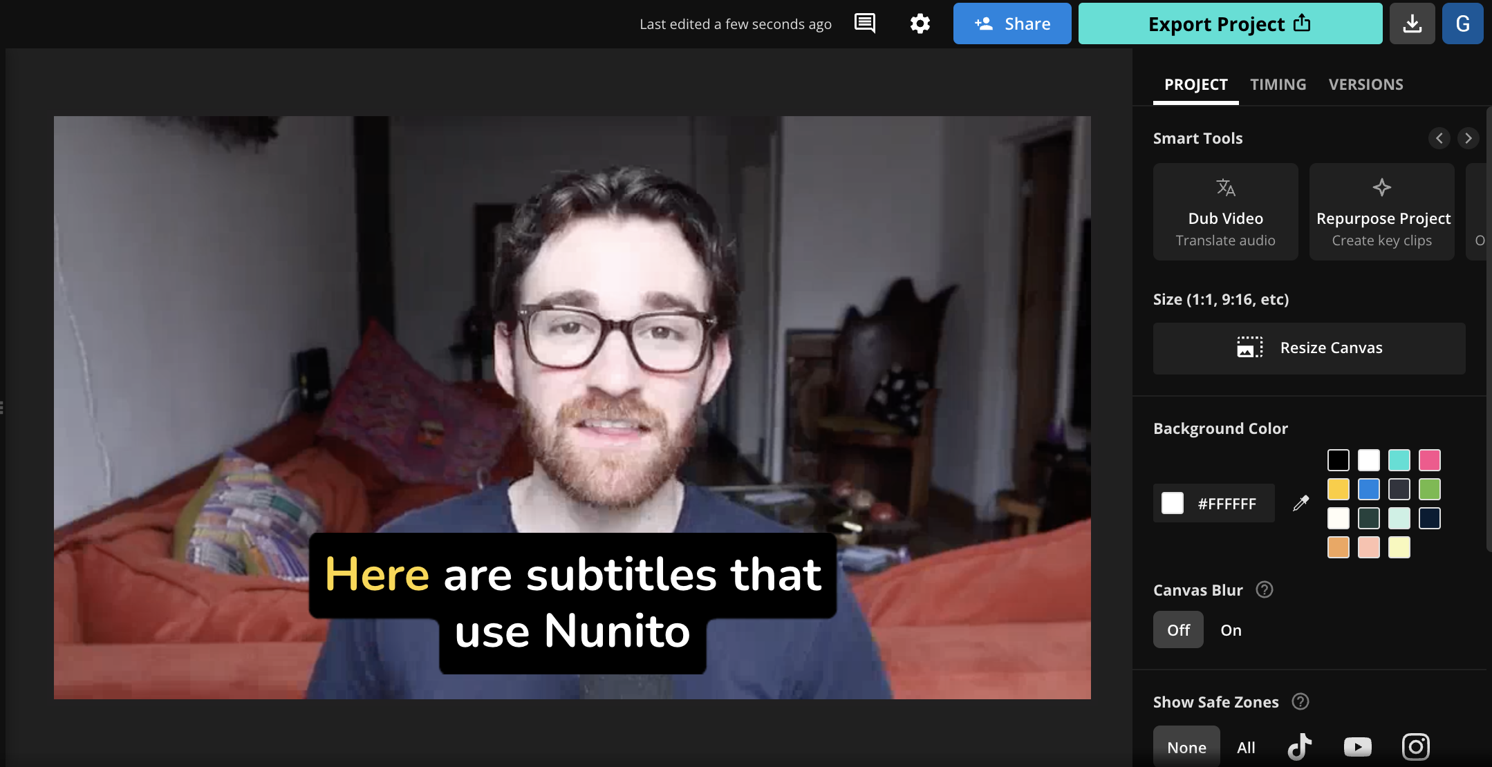
💡 About the font: Nunito is a well-known sans-serif typeface initially designed by Vernon Adams. The font's development began as a single-weight display font, called Nunito Regular, and was later expanded into a full set.
🎯 What makes it good: For many, Nunito strikes the best balance between a chic, almost dressy design for a font while still being highly legible on small screens. You get the required elements for a crisp and clear reading experience—well-balanced letter spacing, clear character shapes, and a variety of weights—in a font with much more flourish than the standard choices.
How does Nunito achieve this look? Well, it's a font with "geometric styling," which means parts of the letters are based on common geometric shapes, like circles and squares. The other aspect of Nunito that stands out is its "humanist qualities," or the fact that, like other humanist fonts, it mimics the style and proportions of the (hand)written word. The end result is a unique and recognizable look that still works well across mediums and screen sizes.
What subtitle font does Netflix use?
Netflix is the most popular online streaming services and has experimented with several different fonts over the years to achieve the most readable subtitles. The default caption font on Netflix is a custom font called "Netflix Sans", a close cousin to Arial, labeled "Block" in font settings. Netflix uses this Proportional San Serif font for the best performance across platforms.
By default, the Netflix caption font is white with a subtle black drop shadow. The drop shadow adds contrast between the text and a moving video background, enhancing readability. If you want to add captions with a drop shadow background, you can generate open captions in Kapwing and use the "Drop shadow" slider to give them a pop.
In Account Settings, Netflix users can change the appearance of subtitles across their profile. Find "Subtitle appearance" in your Netflix Profile > Edit Settings. These configurations edit the appearance of the captions everywhere you're signed in to Netflix, and you can select different settings for different profiles.
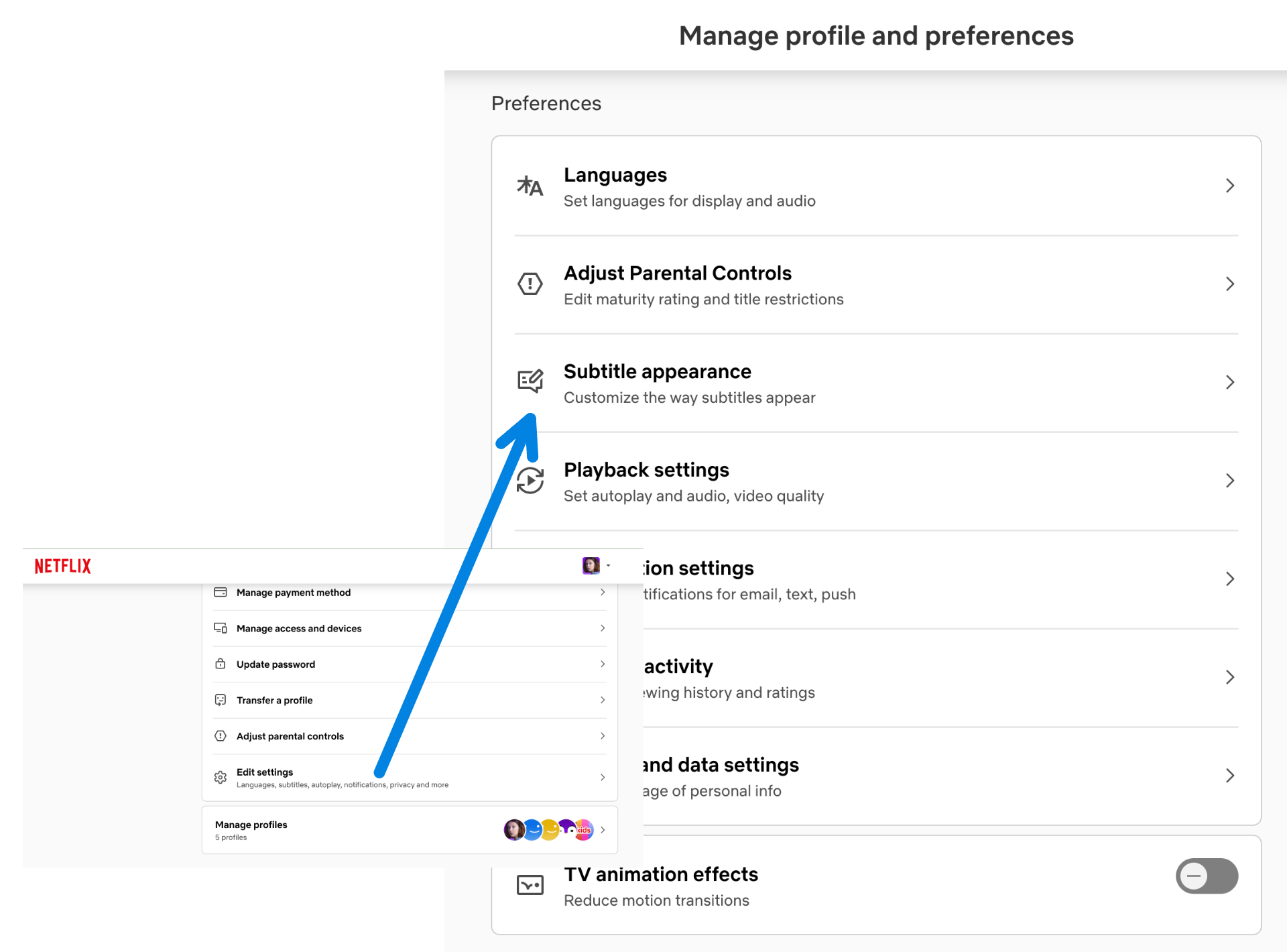
There are six captions font options: Typewriter, Print, Console, Block, Casual, Cursive, and Small Caps. Each maps to a different font family, encoded in the CSS. Here are the six available fonts for Netflix captions:
- Typewriter = Courier New
- Print = Georgia
- Console = Lucida Console
- Block = Netflix Sans. This is the default option and is a close match to Arial or Helvetica Neue.
- Casual = Comic Sans MS
- Cursive = Lucida Handwriting
- Small Caps = Netflix Sans with the small-caps font variant
Netflix viewers can also change the Text Size of the captions, increasing them to Large or Small. Larger subtitles may make the text more visible for people who are hard of sight or hearing, and smaller captions obscure less of the screen to avoid missing the visuals of your show or movie.
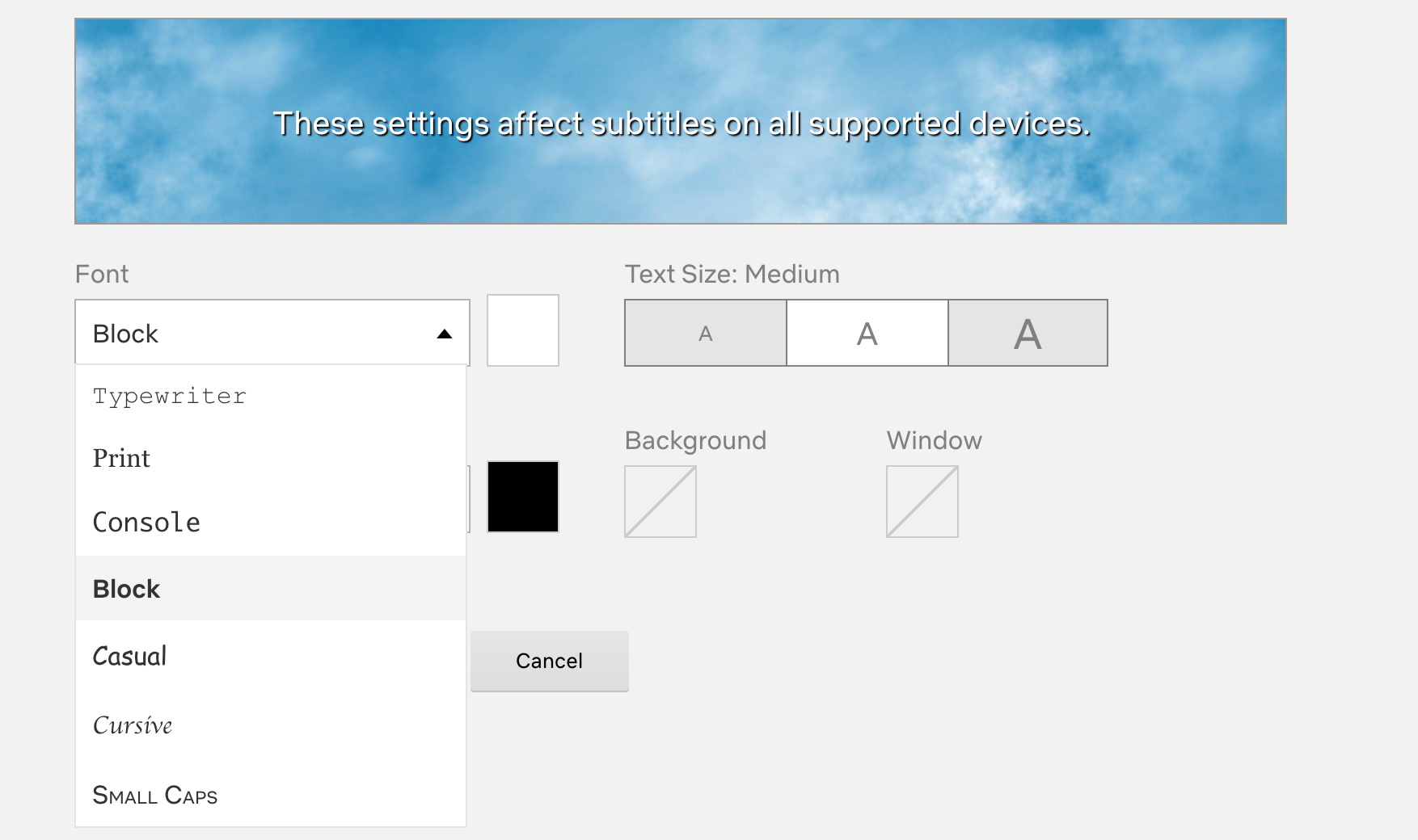
From Netflix settings, watchers can add a colored background or adjust the color of the font or drop shadow as well.
What details matter for subtitle fonts?
When we talk about the best traits for subtitle fonts, in reality we're talking about both the characteristics of the typeface and any custom styling you apply to your subtitles. While the "font" is a critical part of your subtitles, the other design choices you make also affect how legible and clear it is for your viewers.
Research on "glanceable fonts" hasn't been entirely conclusive, but most studies point to large, sans-serif fonts with non-condensed spacing to be easiest to read at a glance. Popular sans-serif fonts were designed for screens and have wider spacing.
All Caps vs Mixed Case
A 2007 vision study found that text in all capital letters is easier to read for short excerpts on small screens. A 2017 study from Dr. Ben D. Sawyer's lab at MIT’s Agelab/Clear-IP backed up this finding, showing that uppercase fonts outperformed lowercase.
- Regular width outperformed condensed width fonts
esearchers gave "phone and smartwatch notifications" as examples, but it's possible subtitles fit the bill, too. This decision would also rest on the font used, and how discernable the capital letters are from each other.
Style: Sans-serif, but serif can be OK
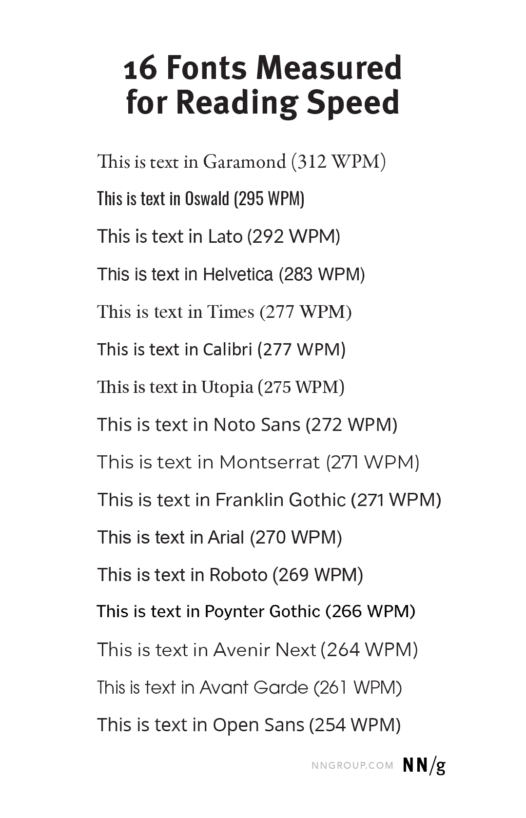
Sans-serif fonts are fonts that do not have tiny lines that extend off of individual letters. What you're reading now is a serif font, which does have decorative strokes extending from the letters. When reading longer-form content, there isn't a major advantage to either style of type—readers sometimes favor serif fonts in print. As long as the reader has a high definition screen, the difference in legibility is low.
However, a 2022 study from the Nielsen Group found that overall, sans-serif fonts scored better for reading speed and attention when it came to so-called "glanceable reading," which is much more similar to how people read video subtitles. Garamond was the top font in their study, meaning that participants could read words faster in Garamond than in any other font.
Font size: Large
When it comes to subtitles, size matters. Larger sizes outperformed smaller sizes in reading speed. The MIT study confirmed that bigger text is almost always better (Sawyer, 2017). Subtitles should be large enough to be easily readable, but not so large that they block the rest of the video content on screen. There's no iron-clad rule for font sizes, but 22 pts often works well for vertical videos.
Together with color contrast and character/line spacing, the font size you choose will have the biggest impact on legibility. A small font size was one of the cardinal sins of "glanceable reading" mentioned in the Nielsen study:
- Don't use a subtitle font that's too small
- Don't use a subtitle font that's too narrow
- Don't use any font that's lowercase only
Contrast
Many video subtitles do not overlay the font on top of the footage. They apply a solid or slightly transparent background to the font so it stands out on the video and contrasts the subject on camera (e.g. for talking head videos) or the background environment.
The Web Content Accessibility Guidelines recommends a text/background contrast of 4.5:1, and there are examples you can check out that help explain what that contrast looks like in practice. Though remember, these are the recommended minimums for contrast.
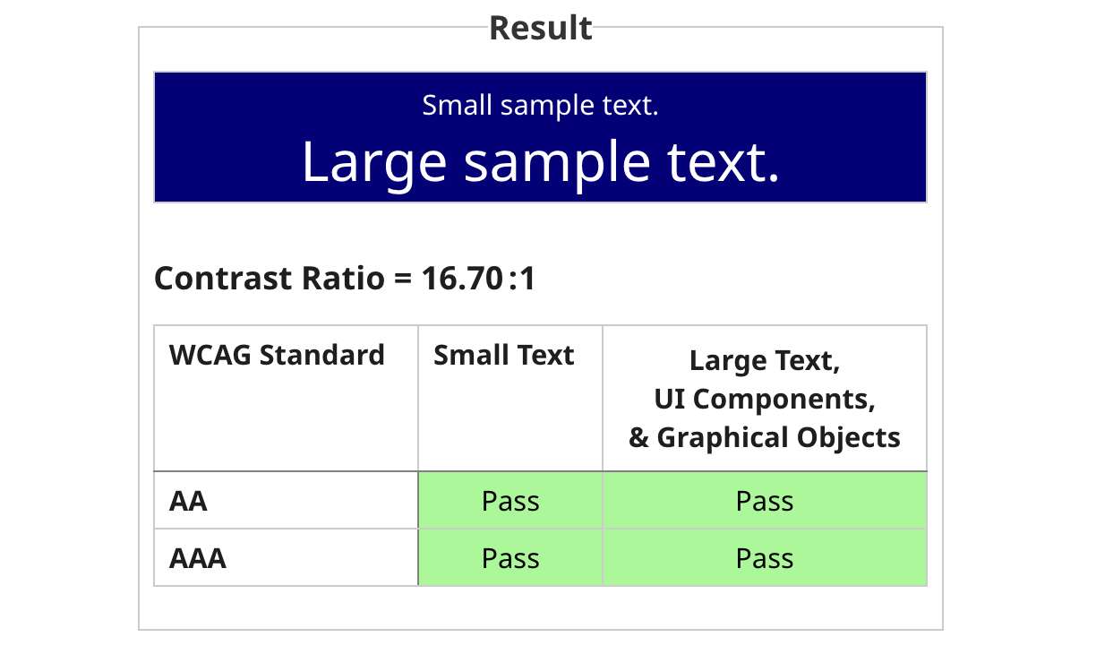
White text on a black background, and vice-versa, are the most legible combination and standard for most closed captions and SDH subtitles. However, you don't need to go that basic to achieve a great color contrast. There are many tools available to help you check the "Grade" of your font and background color for legibility.
Position on screen
We’re used to seeing subtitles appear at the bottom of the screen while a video is playing, but that isn’t always the best option. Sometimes the bottom of a video has scrolling headlines, names, locations, and other valuable information.
In cases where the bottom portion of the screen contains important information, you don’t need to cover it with subtitles. Instead, you can move your subtitle layer to the top of the video, to the middle between two speakers, or even entirely below or above the video frame by adding blank padding to the edges.
This is especially important with videos on social media. The platform interfaces on TikTok, Reels, and YouTube Shorts all obscure at least a portion of the video with the caption, sidebar icons, and search bar at the top. Use a tool like Safe Zones to see where your subtitles are relative to those features so that your video remains legible when you share it on social.
How to use custom fonts for your subtitles
All of the subtitle fonts featured in this article are immediately accessible from the Kapwing Studio and can be used with our Magic Subtitles tool. But if you have a specific subtitle font in mind, Kapwing also allows you to upload custom fonts for your subtitles. Here's how to do just that:
1. Get your font file
Font files are typically .ttf or .otf files that can be found on your computer once you download the font. There are many great (free) font choices available on places like Google Fonts and Adobe Fonts, and both of those locations are always safe to download from—so we recommend you find fonts there first.
2. Upload your font file to Kapwing
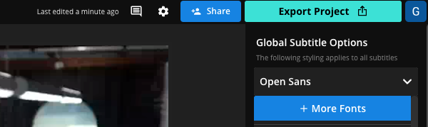
Login to Kapwing or jump right into the Kapwing editor (no account required) and after you've added subtitles to your video, you'll see the font and design toolbar on the right side of the screen. Click on + More Fonts from the dropdown menu.
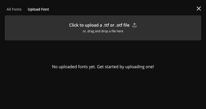
A pop-up modal will appear and now you can select Upload Font. That will prompt you to upload a font family as a .ttf or .otf file.
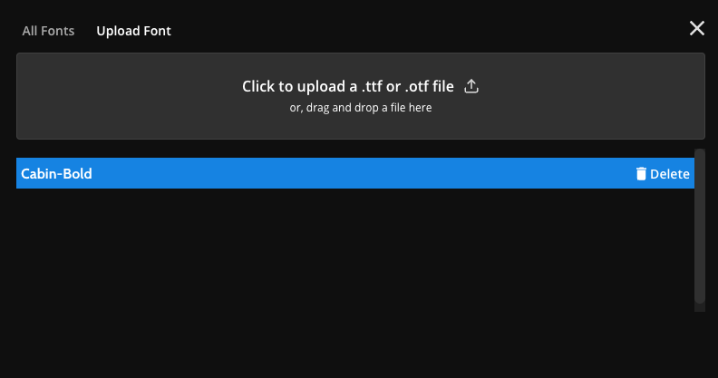
3. Select your font and write subtitles
Once your font is uploaded, it will appear in the pop-up modal with a preview of what it looks like. I've selected a font called Cabin for this example, specifically the bold font.
Now that my font is uploaded to Kapwing, it will always be available on the right-hand toolbar where I can apply effects and design elements to my subtitles. You'll see it in "Recent Fonts" once you've applied it to your subtitles, and you can always search for it in the "More Fonts" option we showed above.
And that's it! Now your custom font is ready to use in your video subtitles.
Subtitle Font FAQ
What's a good subtitle font and size?
The most common size font for subtitles is around 35 pts for vertical videos and 30 pts for landscape rectangular videos. Landscape video platforms like YouTube have smaller font as there is more screen space to read them. But the right size for video captions really depends on the content and format.
What font does YouTube use for subtitles?
YouTube uses Roboto Medium as the default font in the YouTube subtitles and captions feature. However, YouTube's subtitle editor does allow for other fonts to be chosen. All YouTube videos with closed captions have Roboto Medium by default. For custom fonts in a YouTube video, creators need to burn the text layers directly into the MP4.
What font does TikTok use for captions?
The font TikTok uses is called "TikTok Sans," a font developed by TikTok. Previously, the default TikTok font was called "Classic," which was actually the Proxima Nova typeface. Montserrat Semibold is a similar font that you can use within Kapwing or other video editors to match the TikTok style.
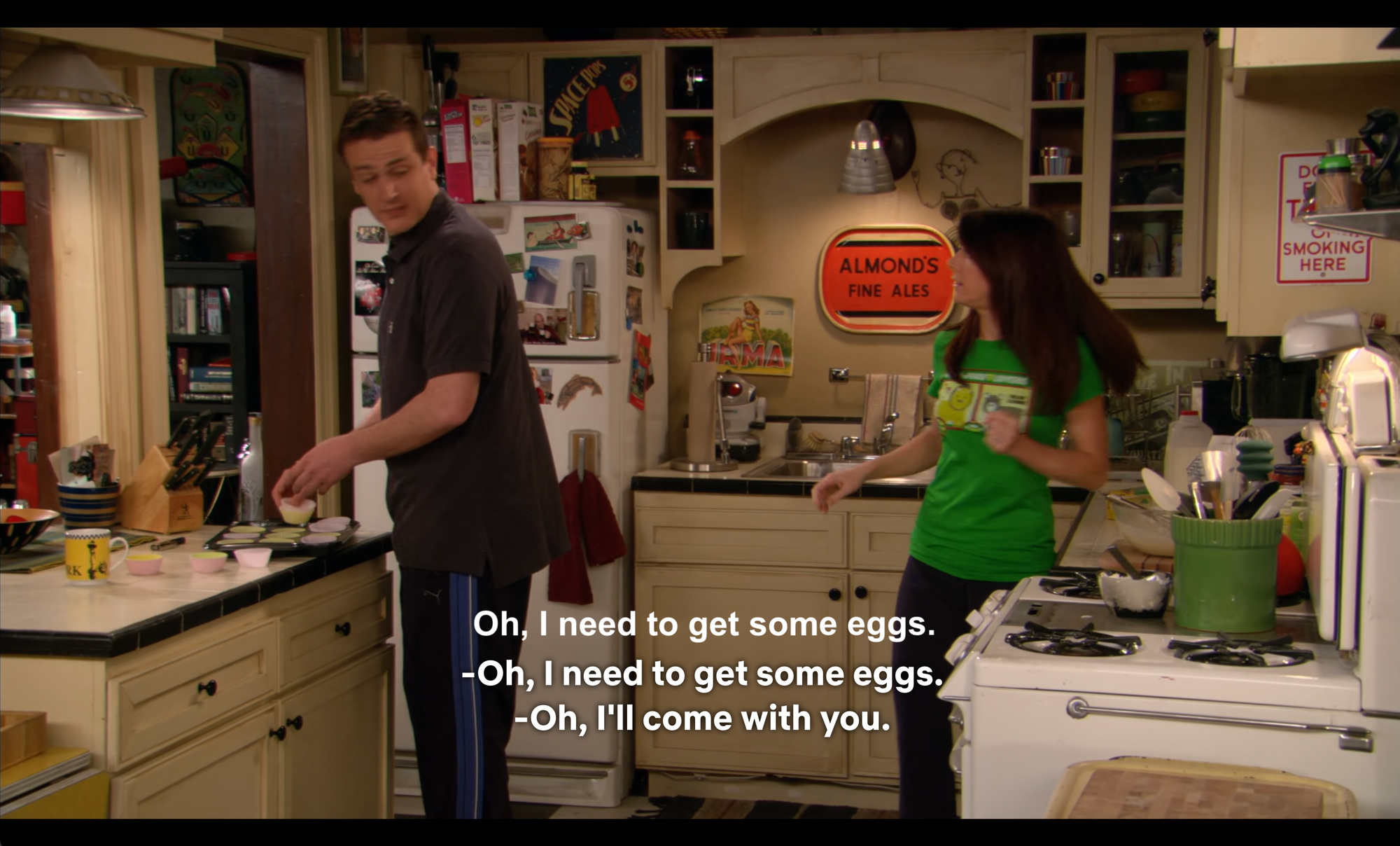
What is the yellow font used in movie subtitles?
Helvetica is the classic yellow subtitle font used in so many movies and TV shows. Specifically, Helvetica with a thin black outline is what most older films use as their subtitles. You can recreate this classic style with Kapwing's Magic Subtitles by following the instructions here.
Is Times New Roman a good font for subtitles?
Times New Roman is a classic font but not a great choice for subtitles. Its serif design and tight letter spacing weren't designed for small screens, and the small x-height of the font often causes the text to look like it's blurring together when read quickly. Overall, there are other, better serif fonts to use for subtitles.