
How to Create an Aesthetic Pastel Color Palette (Plus Examples!)
If you're interested in creating a pastel color palette but aren't quite sure where to start, keep reading. In this article, I'll show you how to build a pastel color palette from an existing image.
There’s just something about pastel colors, isn’t there? Whether you’re revamping your brand colors or just putting together an aesthetic palette for your desktop theme, pastels make the perfect color combos.
Don’t just take it from us: Shutterstock’s 2022 color trends report confirms that more people are using pastel color palettes now than ever.
So, how do you create your own aesthetic pastel color palette? You could spend days diving into the color theory behind designing a color scheme. There's actual science behind why some color combinations are inherently pleasing.
The easiest way to get started, though, is to use an existing image to build your color palette.
In this article, I'll show you how to do just that plus give you a few examples of the different styles of palette you can create like this.
How to Create a Pastel Color Palette from an Image
Creating a color palette from an existing image is a straightforward process that can be broken down into three main steps:
- Step 1: Choose an image as your starting point.
- Step 2: Pull the pastel colors from that image you want in your palette.
- Step 3: Create a graphic with your new pastel color palette.
Step 1: Choose Your Starting Image
Unless you have a starting color already decided on, browsing photos, illustrations, and graphics will help you narrow down what color combos you like. There are plenty of places to find images with pastel color palettes, like Pinterest, stock photo sites, or even just the image search page on Google.
For this example, I'll be using the image library inside Kapwing, an online video and image editor. I'll also be using Kapwing to create the actual palette, so I can keep everything organized and in one place.
Open up the Kapwing image editor and click "Start with a Blank Canvas." From the main studio window, you'll see the "Images" tab on the left side menu.
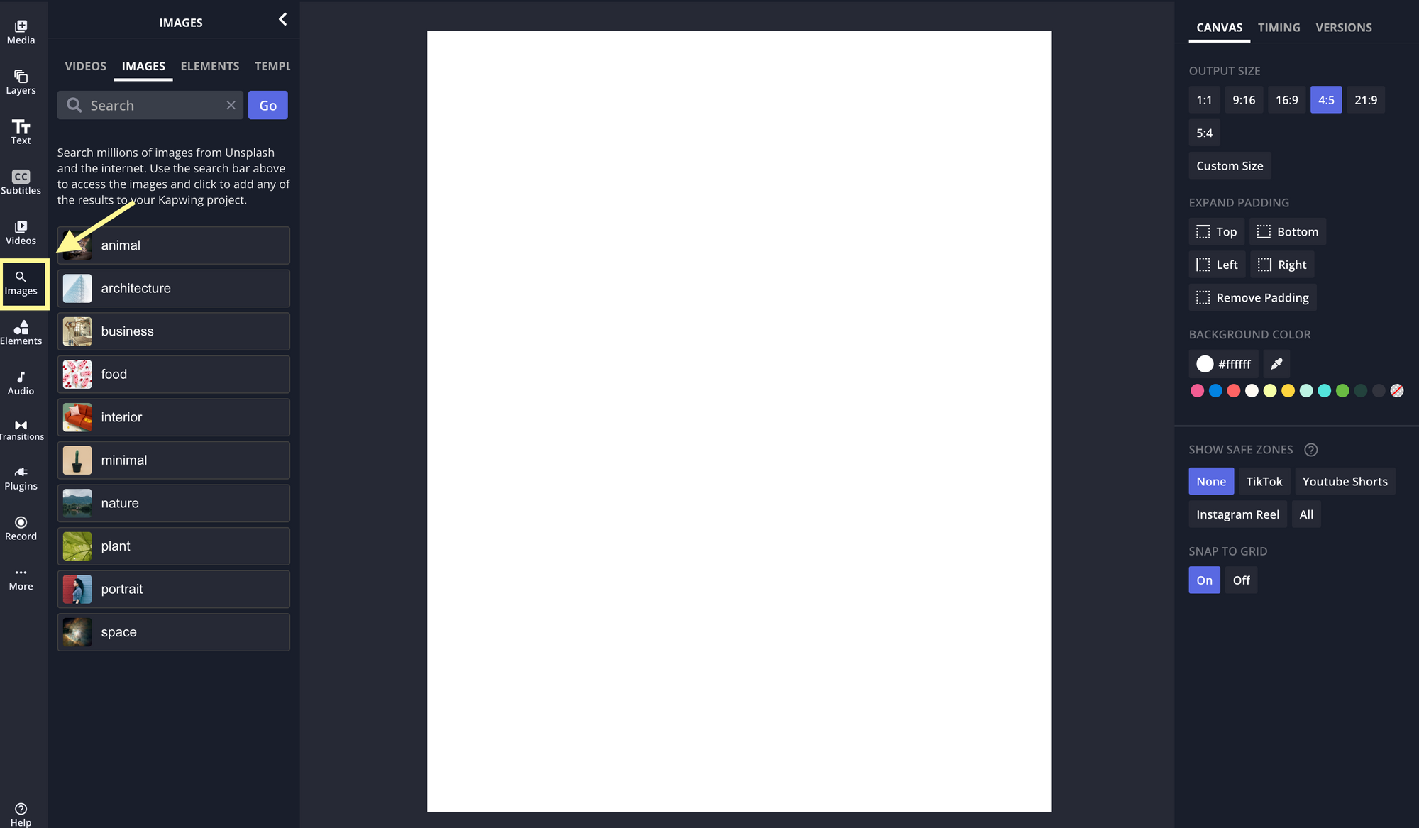
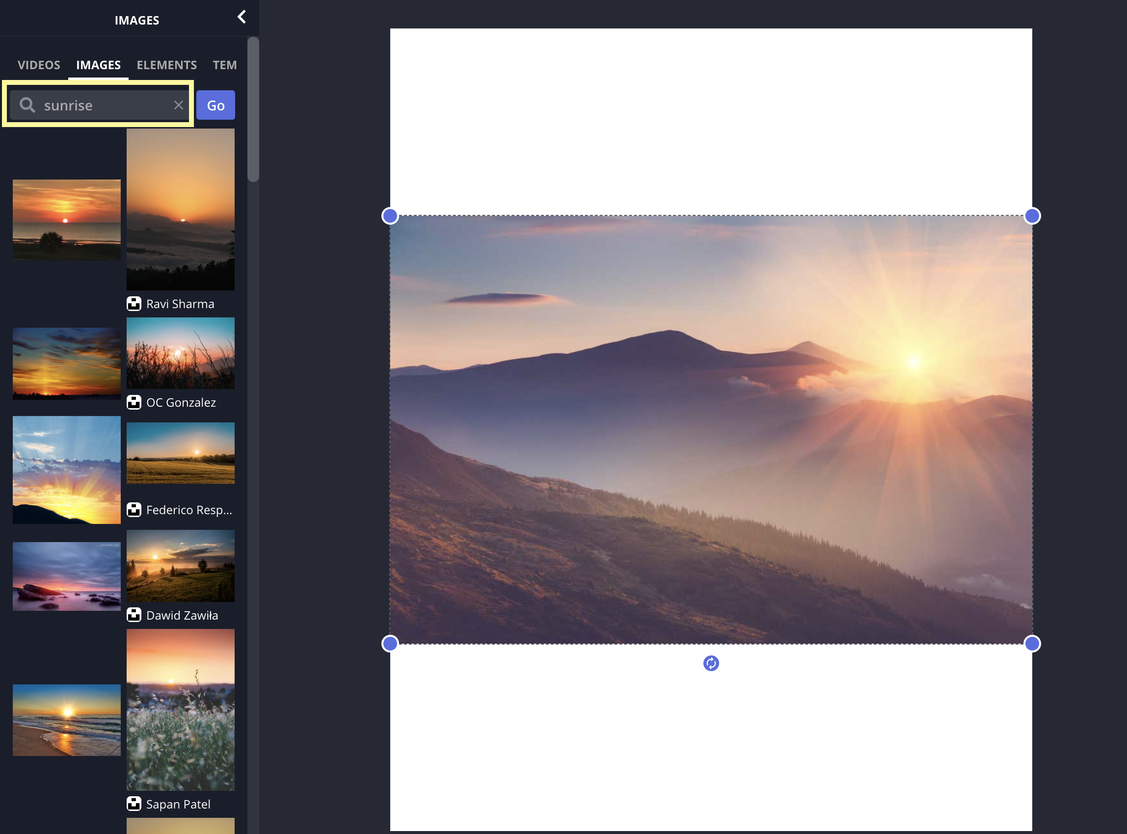
You can browse by the categories outlined or use the search bar to type in something more specific. Floral and landscape images tend to be a good place to look for pastel tones.
Step 2: Select Pastel Colors from Your Image
Now that you have the image chosen that you'd like to use for your starting point, it's time to select the colors.
Open the "Elements" tab and add some shapes to the canvas. Don't worry about arranging them in any aesthetic way. We'll do that later.
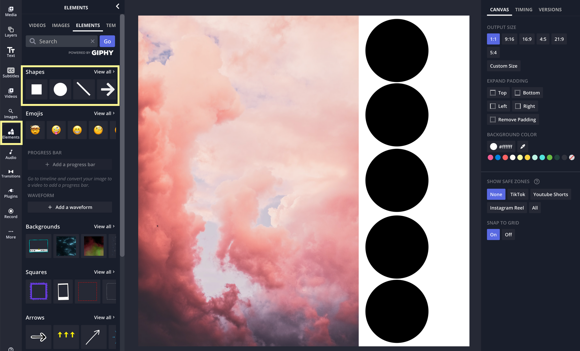
Add as many shapes as the number of colors you want in your pastel color palette. Three to five is standard for most color palettes — it allows for two or three main colors as well as accent colors.
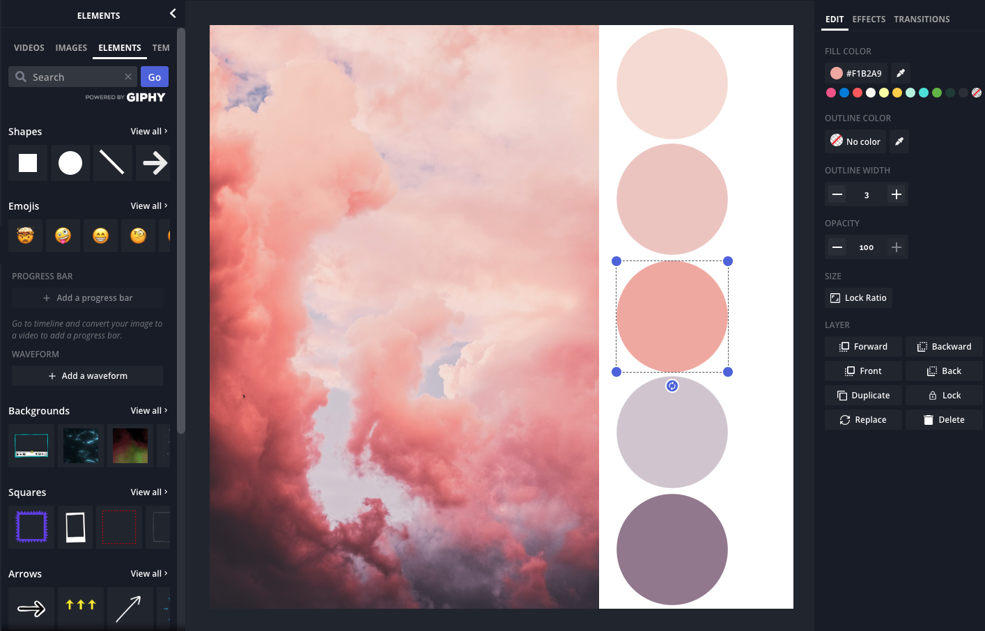
Select one of the shapes and then click on the eyedropper tool under "Fill Color" in the Edit menu. Using the eyedropper, click on the part of the image that has the color you want to save for palette.
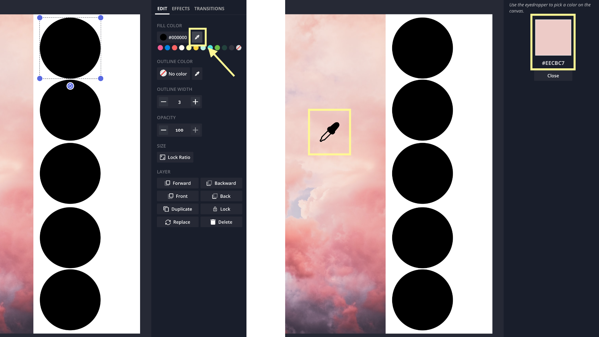
Repeat the eyedropper step for each shape. Be intentional with the colors you choose so that your color palette accurately reflects the color story within the image. Select the most prevalent colors as well as the colors that stand out the most due to contrast.
Step 3: Create Your Pastel Color Palette Graphic
Time to finalize that color palette.
The design of your final palette is completely up to you. You can keep it minimal with just the colored shapes. Or, if you want the color palette to also communicate a specific vibe or aesthetic, you can leave the inspiration photo in.
I opted to do the latter. I also added the HEX color values, so anyone else using this graphic for reference would be able to replicate the exact colors, with or without an eyedropper tool.
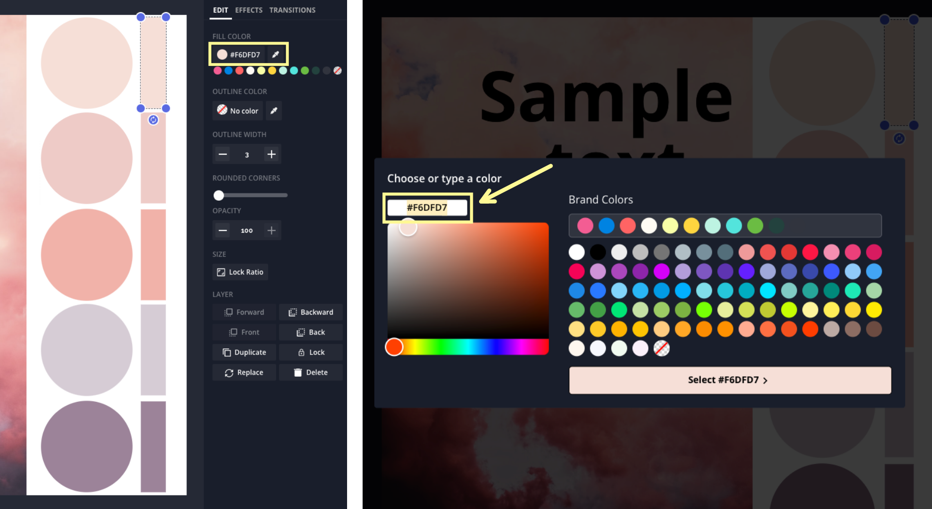
You can find the exact HEX code in the "Fill Color" tool in the Edit menu when you select a shape. Open the Text tab in the left side menu to add a text box and copy-paste the HEX code into it.
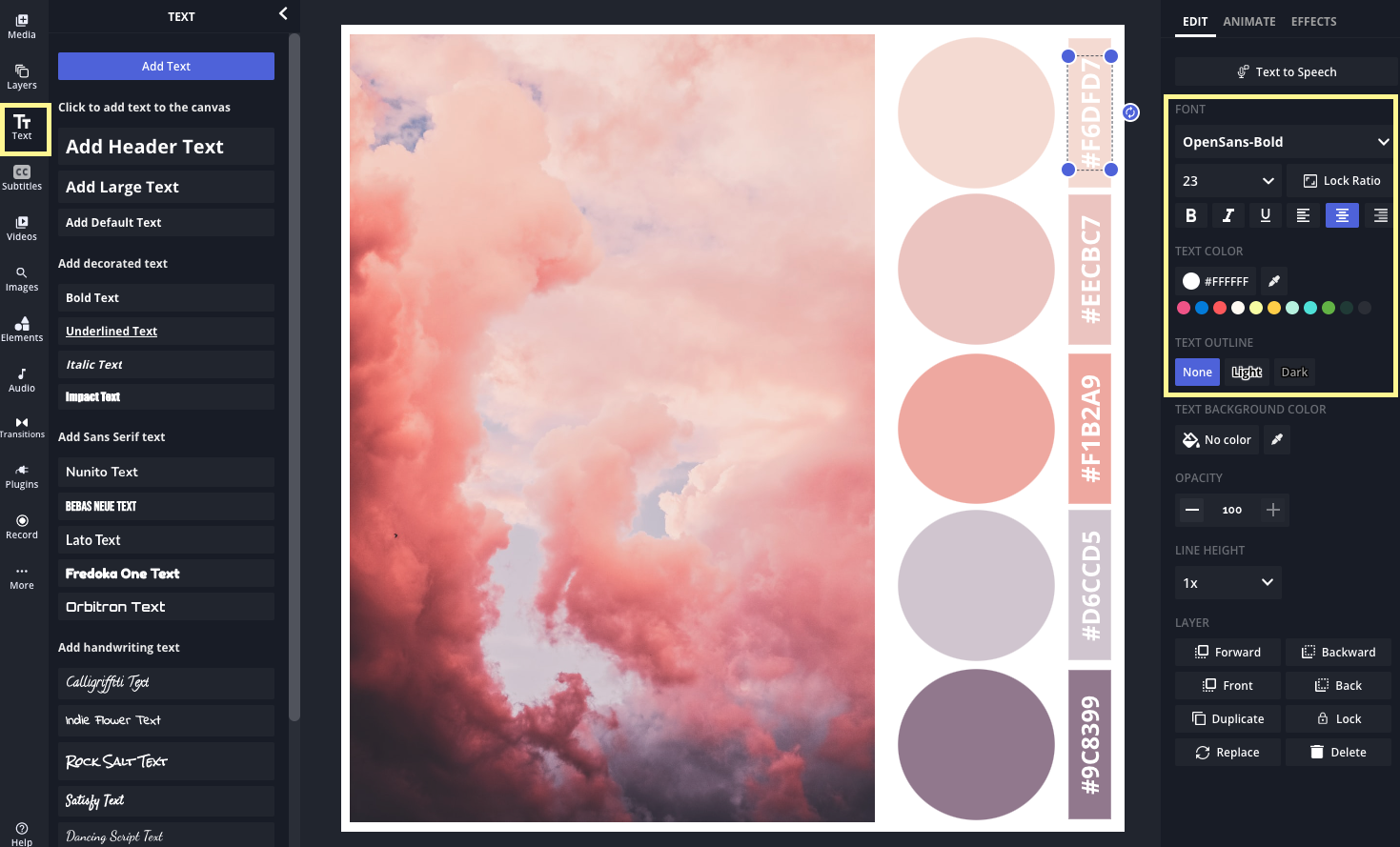
In the right side menu, you'll find plenty of customization options to edit the font style, size, and color.
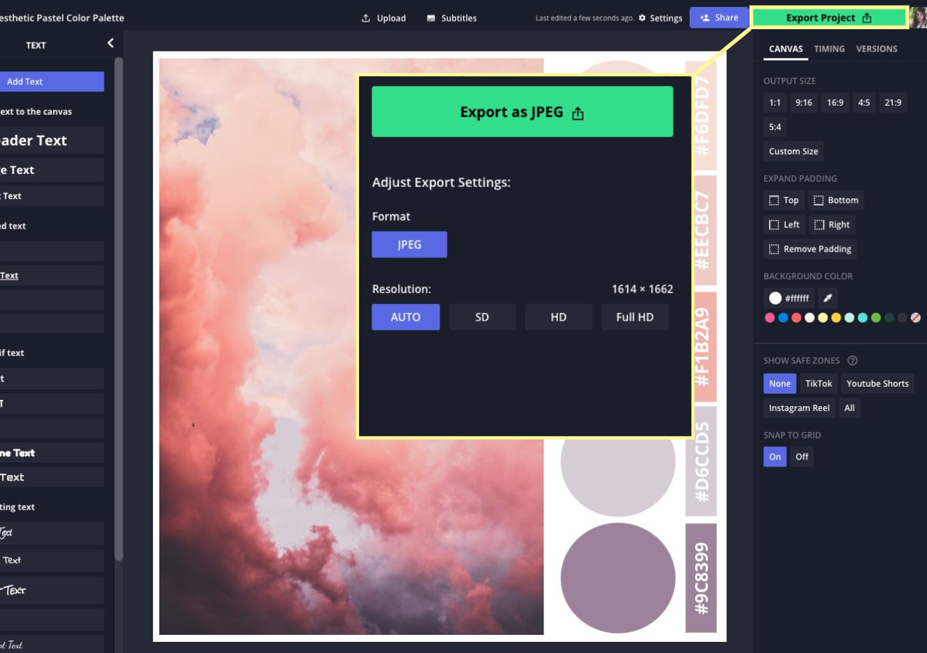
When you're finished, select "Export Project," choose your file type and resolution settings, and then download your new pastel color palette. Now you can share it to your Pinterest mood board, send it to your design collaborators, or just save it to your media folder for future reference.
Examples of Pastel Color Palettes
Need a little more pastel inspiration? Browse these pastel color palette examples to get your creative juices flowing.
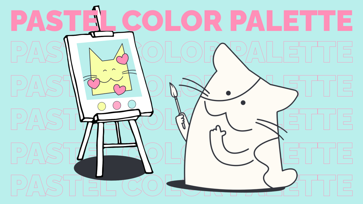
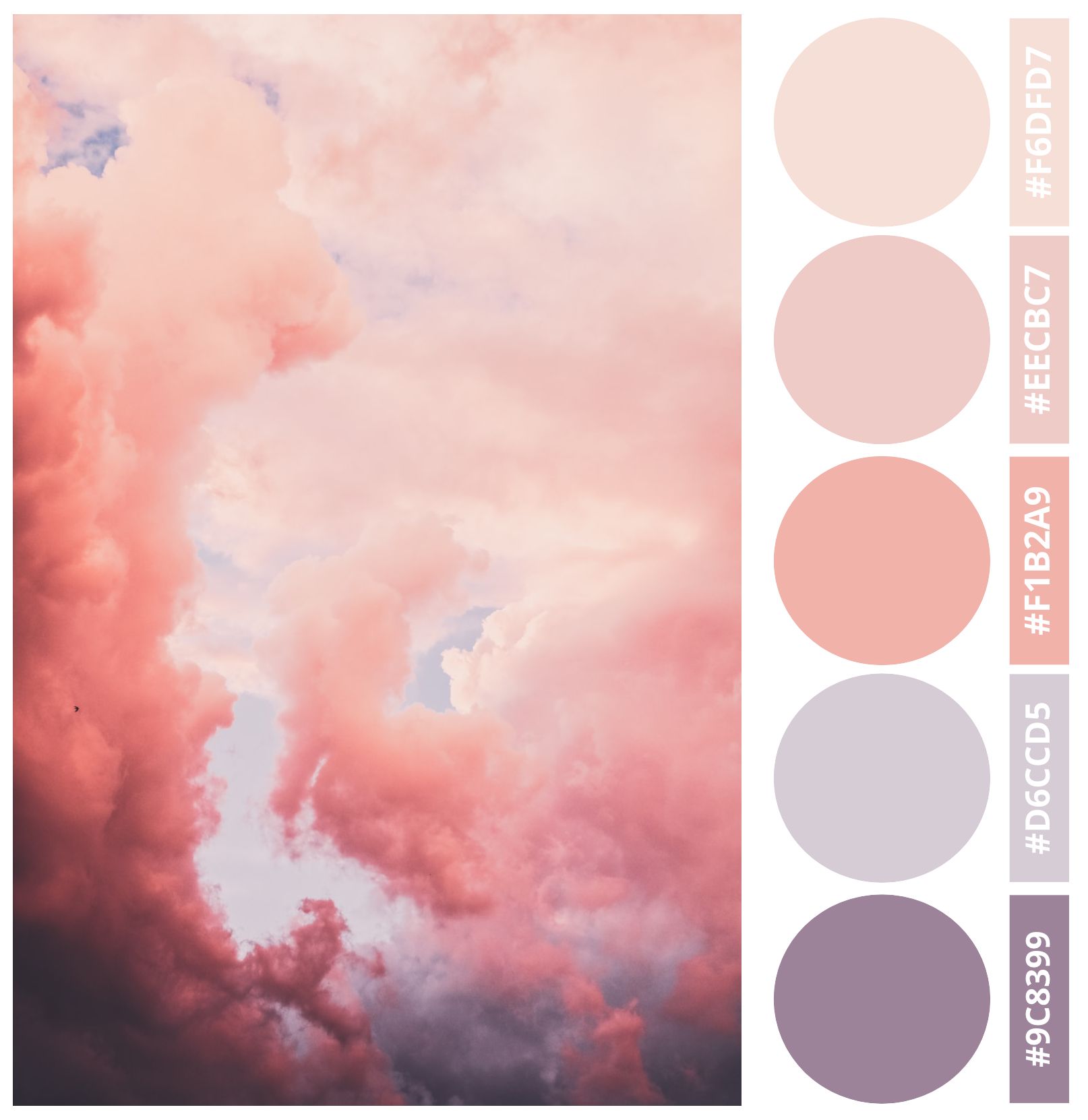
1. Cotton Candy Skies
This is the finished product for the pastel color palette I was creating during the tutorial. It's full of pastel pinks and dusty purples. Having both the HEX codes and the larger color circles makes this palette easy to use as a color reference with or without an eyedropper tool.
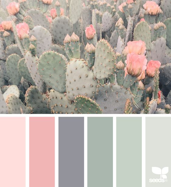
2. Floral Cacti Palette
Just one of many different color studies and palettes created by Jessica Colaluca, founder of Design Seeds, this cactus palette is a great example of how color palettes can convey specific moods. The juxtaposition of sharp cactus spines and delicate desert blossoms is echoed in the blush pinks and desaturated grey-greens of the palette.
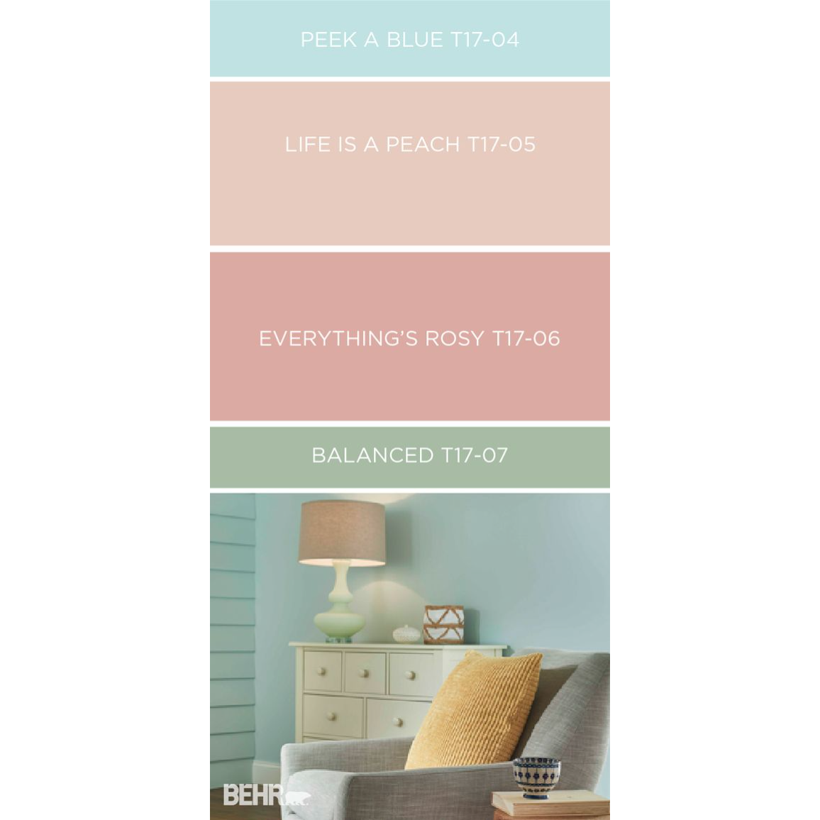
3. Product Placement Palette
Behr Paint does a great job of showcasing their product by making custom color palettes. This example shows a four color palette (with the names and numbers of the specific paints) next to a room that was painted with those shades.
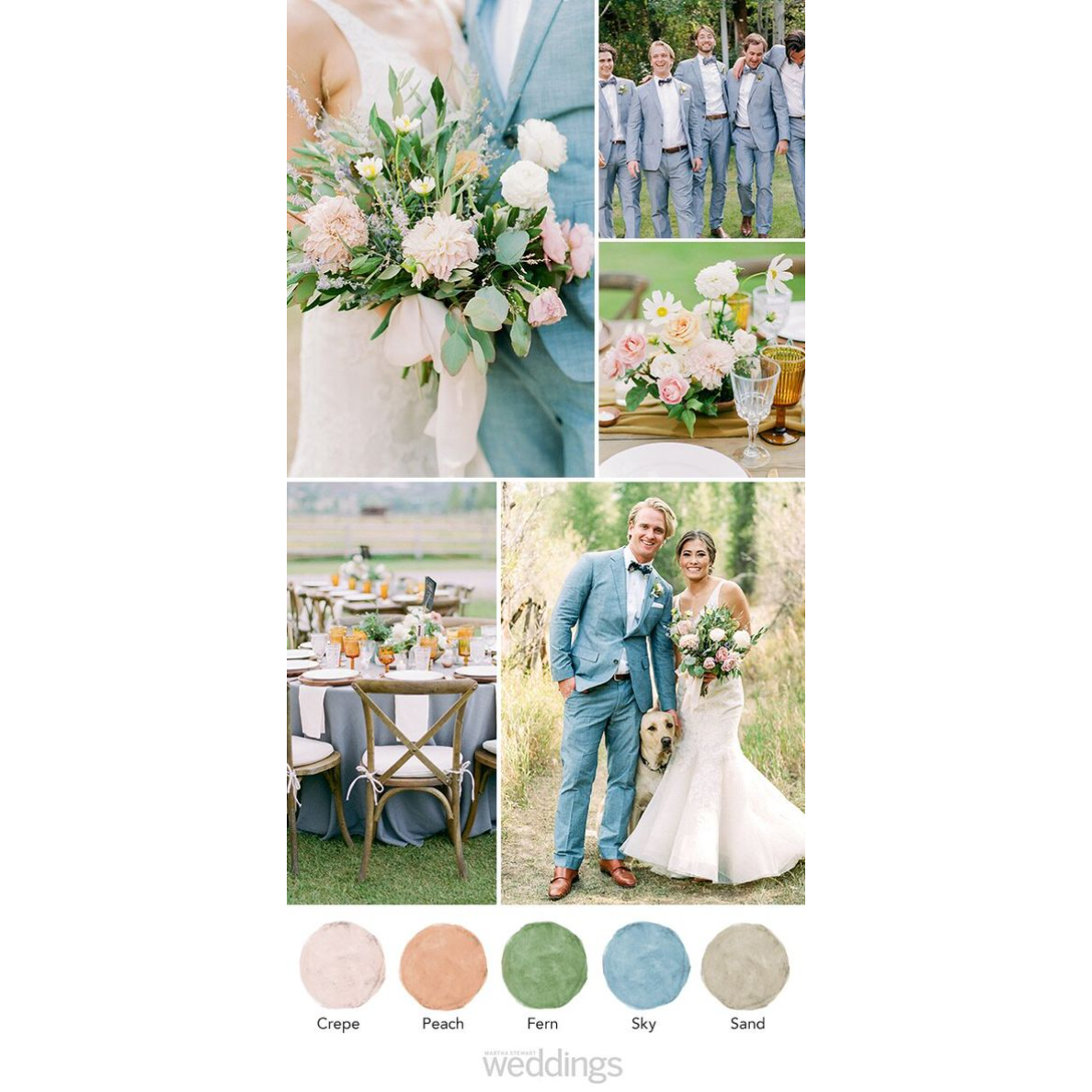
4. Pastel Wedding Palette
Unlike the previous examples, this color palette uses a collage. A photo collage is a good way to both capture a specific aesthetic and make sure you've included all of the accent colors you want in your palette.
5. A Midsommar Night's Palette
Finally, remember that inspiration can come from anywhere! Color Palette Cinema on Instagram takes iconic scenes from movies and turns them into stunning color palettes. This example is a clip from Midsommar. You can do the same — grab a still from a dreamy, pastel scene in your favorite movie (may I recommend Studio Ghibli if you're looking for gorgeous, pastel backgrounds?).
I hope this has inspired your pastel color palette creation and given you the tools you need to make your own. Tag us on social, @KapwingApp, if you make a color palette with Kapwing. We'd love to see what you create!
And if you're in search of more creator tips, inspiration, and news, check out our Resources Library. It's packed with great info made with creators like you in mind.