
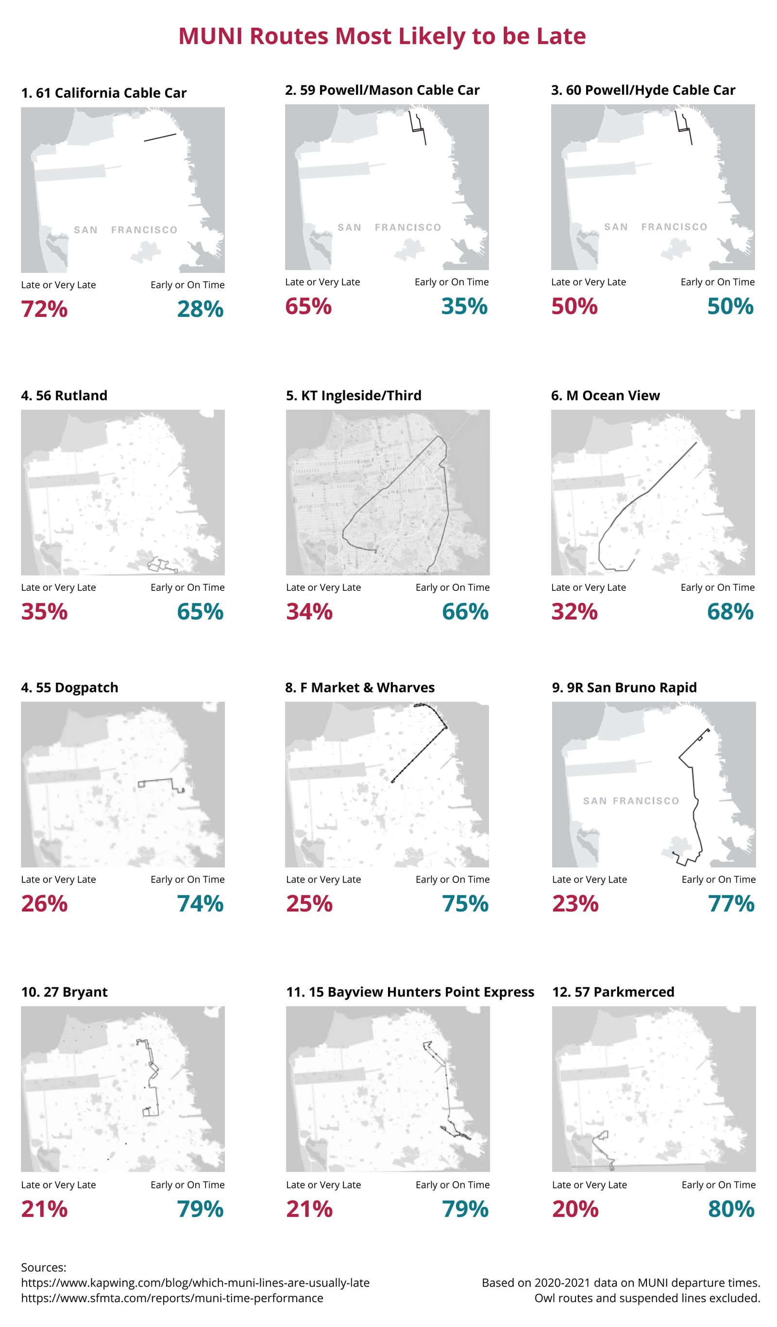
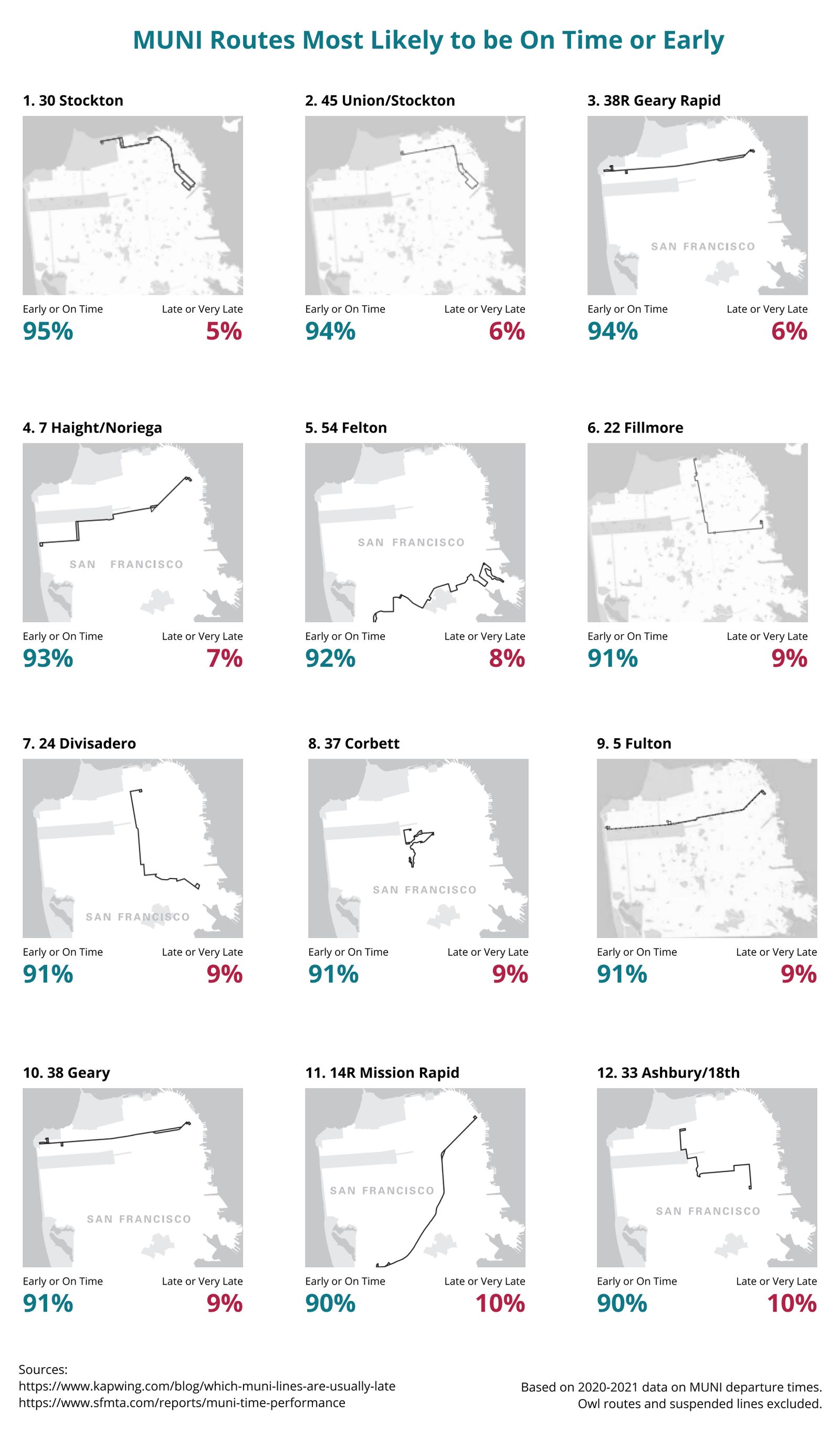
Which MUNI Lines are Usually Late?
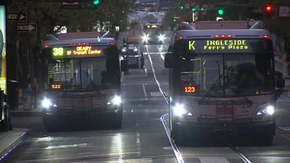
With the mask mandate eased and more of our team wanting to work from our office in San Francisco, the number of employees commuting on public transportation has been increasing over the past few weeks. Our company, Kapwing, is an online video editing startup with an office near the Civic Center in SF. Many folks on our team rely on MUNI, the local public transportation service to get to work, as our office is just a short walk away from a few different MUNI bus and metro stops.
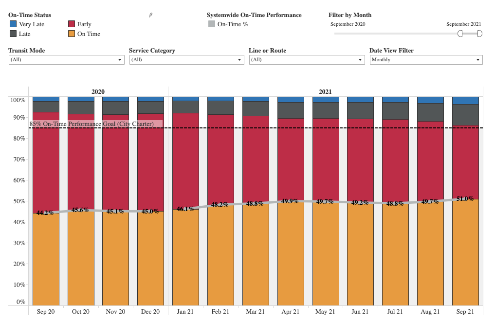
With commutes on MUNI increasing, we wanted to look at some data around MUNI rides to better help our employees get to work. We noticed on October 1st that the SFMTA (the governing body of MUNI) released new data related to MUNI on-time performance. The data showed that in aggregate over the last year, the % of MUNI lines that departed on-time (defined by departing within one minute early or four minutes late of the scheduled arrival) had increased from 44% to over 50%.
While the provided data visualizations showed that the agency had been improving MUNI on-time performance over time, we were interested in exploring the data to see which specific lines performed best or worst when it came to arriving on time. Which MUNI lines were more subject to late departures than others? And which lines were more likely to depart early or on time? While the aggregated statistics provided by the SFMTA were good in capturing overall performance, we felt that they didn't showcase the individual performance of each line, which was more critical for our teammates, who were usually just taking a single particular route to get to work.
Without further ado, here are the top routes for latest and most online (click to view the images in high resolution)! Then, I'll write a little bit more about how the analysis was done using the dataset provided by the SFMTA.
Data and Methodology
The original dataset is provided by the SFMTA and contains information about departure times for every MUNI line each month dating back to 2011. We took data from Jan 2020 until Oct 2021 and aggregated it for each unique MUNI line. The dataset contained the percentages for a line to be early, on-time, late, or very late. To simplify our analysis, we combined early and on-time into one metric, and late or very late into another. We then sorted all the unique lines based off of the percentage of times a line was either on-time or late. For the final images, we excluded lines that have been suspended or have service affected. We also excluded OWL lines (routes that run only late at night) so that we could examine the more popular routes. The full dataset that we aggregated can be viewed online here.
Observations
What was interesting was that all three cable car lines operated by the SFMTA topped the late departure time charts. Some ideas I had around this were that its possible that the cable cars attracted more tourists, who are interested in taking it slow and don't necessarily need the cars to get to destinations on time. Another hypothesis could be that the cable cars are older and may not run as reliably as the light rail or buses.
I was also interested to see that the top three most on-time lines, the 30 Stockton, 45 Union/Stockton, and the 38R Geary Rapid were all lines that ran through the northern part of the city. It's possible that this area, with wealthier neighborhoods and less density, gets less traffic and has more predictability when it comes to clear roads.
While a full analysis of the reasons behind the ranking of the MUNI lines is out of scope for this post, I would love to dive more into why certain lines depart late much more often than others in a future article.
Conclusions
As a local, SF based company, Kapwing cares deeply about the improvement of MUNI over time. While the aggregated data does show that the SFMTA has improved on-time departures over the last year, it doesn't tell the whole story about each particular route, which is what really matters to the individual rider. We hope that this data will be helpful for other residents or businesses in San Francisco when planning their commutes, or advocating for improvements to public transportation.
Liked this article or just analyzing data in general? Live in San Francisco? We're hiring for a variety of roles at Kapwing. If you want to discuss public transit data more, feel free to tweet at me too, I'm at @realericlu.


